Pages

Thursday, December 31, 2009

New Year's Cheers

I've always thought Christmas was my favorite holiday, but you know what?  New Year's may really be the best.  I love starting out with a fresh year and I like wrapping up the current one.  One thing I've been doing for as long as I can remember is reviewing my journal for the outgoing year to see how I did on resolutions and objectives.

From the beginning of my career, I was required to set quarterly objectives and sometimes annual ones also.  I carried this habit over to my own business when becoming self-employed.  I've also added my own personal goals.  I've made those "what I want to do before I die lists" - now called Bucket Lists.  I was even interviewed as part of an article for USAToday when the movie the Bucket List was coming out.  They asked for people to write in what was on their list and I did.  They picked me to call and ask a couple of questions.  It was neat!   So I've always thought ahead on what I should do and I've always looked back on my objectives to see how I measured up.  My favorite part is the "In Addition To" list.  It makes me feel so good to see that I've really accomplished so many things each year.  Even little stuff gets big when you write it down.

Like most people, I've also created New Year's Resolutions. Those things like - "I am going to exercise 4 times a week."  Yeah, hmm, well that usually lasts a week or two.  I even made it about 5 weeks one year on the exercise goal before my knees protested, I got bored, or something.

This year has been a little different.  I made 3 resolutions.  And - drum roll, please - I kept 2 of them!!!  I think that is pretty darn good.  My 3 were:

  • stay off of a certain discussion board (entertainment related that wasn't entertaining me.  It was actually adding stress plus it was eatting a lot of time.)
  • do something creatively new every day.
  • Lose to (insert specific - not going to be mentioned - weight here) by March 31.
Guess which one I didn't accomplish?  (Hint:  I actually gained a little this year, but my clothes still fit so I'm calling it even.)

The other two I'm proud to say were successes.  I've not once gone to that annoying website I wasted too much time on in 2008.  I even discovered so many amazing craft blogs in 2009 that I have plenty to enjoy on-line.

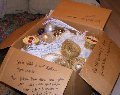
More imporantly, I've done something creative every day - and something at least a little bit NEW, too!   Sometimes it was trying a new recipe, a new card technique, learning just one little thing about Photoshop Elements that I didn't know before.  I counted creative entertainment ideas like finding a fun place to take my aunt on our regular trip to Charlotte for a doctor's appointment. Yesterday, I even counted creative storage solutions as I was repurposing items to store Christmas tree ornaments in.  (I didn't buy anymore so why didn't they all fit in the box they came out of?)  This resolution has made me really hunt ways to do things differently, learn new stuff, create more cards and other goodies, and think a little differently.

So what's on my list for next year.  I've got some ideas...  For now, here's wishing you a wonderful New Year.  Ring out the 00's and get ready for the teens!

Wednesday, December 30, 2009

Gifting Challenges


The biggest Christmas challenge for our family is figuring out what to get my parents.  My mother is pretty good at telling me what she wants though she often waits to the last minute or asks for something seasonal - and not the winter season.  She did both this year.  Daddy refuses to make a list and continually says "I don't need anything."  He has figured out though that if he doesn't come up with something Lenny will buy what HE really wants to borrow.  Although the photos don't show it, Daddy did get a nice leather jacket from me and some shirts he wanted.  He just needed to have at least one more thing on his list to avoid that chain saw that I know he will never use ...which probably a good thing.

The most important gift this year was that we were all together.  You can't put love in a box anyway.


To capture this little bit of Christmas cheer and angst, I scrapbooked.  To create the letters, I used the SCAL software for my Cricut.  In this case, it would have been better to use a cartridge with a shadow feature.  After cutting and stamping the letters in Real Red ink on white cardstock, I realized they needed a white shadow to help them show up on the background paper.  Unfortunately, I'd accidentally resized them in my SCAL file and saved the wrong size. It took a few tries to get shadows that are somewhat OK looking. 


Finally, I'm beginning to stop 'saving up' my good stuff for some unknown future occasion and used quite a bit of this Stampin' Up! ribbon and a special piece of designer paper that is part of a kit.   

Ingredients:  Stamps:  Impression Obsession
Ink:  Real Red, Whisper White
DSP:  Basic Grey Periphery collection; kraft by Creative Memories
Ribbon:  Stampin' Up; baker's twine by Martha Stewart
Chipboard:  Stampin' Up!

Tuesday, December 29, 2009

TIPsy Tuesday - Stamping Ahead


Staz-on permanent ink is the best choice for stamping designs that will be watercolored.  However, it is a bit more on the cleanup as it needs the special Staz-on cleaner to get all the ink off your stamps.  So when you are stamping a few images in black or brown Staz-on to color, why not stamp a few extra?  Store the extras with your stamp set and you'll be pleasantly surprised to have them ready the next time you are ready to use this set.


Note:  This set, Playful Petals, is one of several being retired in the next few days.  If you want to get it before it is gone, contact your Stampin' Up! demo.  Don't have a demo?  Check my friend, Jean's, site by clicking the link on the right under Places to Shop.

Ingredients:  Stamps:  Stampin' Up! Playful Petals and On Your Birthday
Ink:  Staz-on black, Watercolor crayons by SU!
Cardstock:  Kiwi Kiss
DSP:  Raspberry Lemonade and Urban Garden by SU!
Ribbon from Stamper's Alley

Monday, December 28, 2009

Treat Boxes


Happy Birthday this week to our friend, Steve!  Here's the treat box I cut with my Cricut and a template from The Project Girl, Jen Allyson.  See her blog entry to download a free copy of this template for the Cricut or Sihlouette cutting systems --> Project Girl Cookie Box Blog Entry  I think she mentions this on her blog but just in case....  Hint:  Resize the template a quarter inch smaller for the bottom of the box so they fit together easier.


I also made up a box of these brownies for my parents.  My mom just loves them.  I'm not sure she shares very well :-)  Hopefully, Daddy will get a few of these also.  They are Martha Stewart's from her Baking Handbook.


Ingredients:  Stamps:  Circles and Dots by Inkadinkado; On Your Birthday by SU! (greetings)
Ink:  Close to Cocoa and Old Olive
DSP:  American Crafts and Three Bugs in a Rug
Ribbon:  Stampin' Up!; baker's twine by Martha Stewart

Sunday, December 27, 2009

"Heart" Break

During most of this holiday weekend, I've been stripping wallpaper.  Yuck!  For a break, I'm doing a few Valentine cards.  This one uses a shape from the Cricut's Accent Essentials cartridge.  I'm slowly finding more and more uses for this cartridge I'm dismissed earlier.  Jumbled letter greetings are a great place to use markers.


Ingredients:  Stamps:  Alphabet Soup from Stampin' Up!; Polka Dot Basics from Papertrey Ink
Ink:  Melon Mambo and Bold Bright Markers from SU!
Ribbon: Wrights

Saturday, December 26, 2009

Quick Cards and Good Books


Hope everyone's holidays are going great! I did these birthday cards last weekend or early in the week. I've lost track. The starting points were layouts of cards I'd seen on Splitcoaststampers. From there I used all different papers, colors and stamps. Sometimes you want a sketch or a favorite card to go by so you can just create - a little less thinking and deciding and a little more cutting and gluing.


Also, I've updated my Shelfari though there aren't many books added. I haven't been reading as much this fall as usual. I do highly recommend the "Knitting" series by Kate Jacobs. It absolutlely has to be read in order though. The Friday Night Knitting Club is the first book and I just finished Knit Two. Any crafter can appreciate these books whether you knit or not. I used to but don't anymore. Jacobs has created a large diverse group of characters that are all flawed and immensely likeable and identifiable.
Surprisingly I enjoyed Jude Devereaux's Return to Summerhouse. I'm surprised because I normally don't take to the supernatural yet it was entertaining. The Fixer Upper by Mary Kay Andrews is enjoyable but not her best. You see where this one is going very early on. If you have never read her books, I highly recommend them but start with Savannnah Blues or my fav Hissy Fit - (now here is a book I love to live vicariously through!). Finally, I normally enjoy Sandra Brown but not Smash Cut. It started with a completely unbelievable premise and could never recover. So those are some of my hits and misses in chic lit and suspense reading this fall. Nothing like a good book on a cold day.
Ingredients: Stamps by Stampin' Up! Scallops; On Your Birthday
Ink: Various markers, Tempting Turquise, White gel pen
DSP: (top card) American Crafts (bottom card) Stampin' Up!
Ribbon: fabric store

Thursday, December 24, 2009

Peace, Joy and Love to You


Wishing you a holiday season filled with Peace, Joy and Love. Thank you for visiting!

Ingredients: All except yarn are Stampin' Up! Stamps: All Holidays for greeting, Serene Snowflakes
Ink: Baja Breeze, Brocade Blue, Rich Razzleberry; Versamark
Embossing Powders in White, Clear and Silver
Ribbon: Brocade Blue

Wednesday, December 23, 2009

Cats On the Bag


Cats, the Cricut and Polka Dot stamps - three of my favorites combine for this adorable bag. It is going to another cat lover of course. Actually it even has a present for her cats inside!

I can't tell you how many different bags I cut before one was large enough for this gift and it isn't that big. It was all about experimenting with the Bags, Tags and Boxes cartridge for the Cricut and the types of paper I could find. The magic combination was this blue art paper I bought at Hobby Lobby. I honestly don't know what artists use this paper for but it is about 25" long and more than 12" wide so I could cut it to fit my 12x24" Cricut mat and still have some left over for other projects. It comes is many pretty colors. I hope they put this stuff on sale sometime so I can get a few pieces for other bags.

The Fit to Size Page option for the "Shopping Bag" design created this bag which measures 8 1/4" tall with handles, 7- 1/2" wide at the bottom and 3" deep.

The most fun was stamping it with dots, cats and some snowflakes just to make it holiday-ish.


Ingredients: Stamps: Cats and Holiday Seasons by Inkadinkado; Polka Dot Basics by Papertrey Ink

Ink: Real Red, Whisper White and Basic Black by SU!

Ribbon: Stitched Grosgrain in Real Red by SU!

Tuesday, December 22, 2009

TIPsy Tuesday - A Fresh Start for Chipboard

I really loved the blue chipboard shown below when I bought it on a close-out. It's so pretty. I've long ago thrown away the packaging so I don't know who made it. Unfortunately, I've found little use for these patterned blue pieces. Either they weren't the color, shade of blue, or just had too much pattern to work on layouts in the past. I may have used a few of them once. However, they were the right size for the "Handsome Boy" layout (posted on 12/16/09) just not a color match at all.

One of the many great things about chipboard is that it is just layers of paper stuck together. So if you don't like the top (or you mess up the painting, stamping or whatever), just peel off a layer and start fresh.


Take a craft knife, and carefully peel up the edge.


Then just peel away the rest of the top by hand. Take care not stay within the same layer of paper.


The resulting very white layers looked so much like Jasper's white fur that I decided not to recolor the tops. You could paint, dab on ink or stamp the remaining chipboard. You may even be able to use the tops that are leftover depending on their condition.


So take a new look at your decorative chipboard and forget about the current color. You can always rip off the top layer and start fresh.

Monday, December 21, 2009

Last Minute Gifts

A wonderful appreciation or hostess gift is a set of monogrammed notecards. These use the Lovely Letters alphabet from Stampin' Up! I made them a little smaller than the standard card size.

I got the card design from Kristina Werner's Year in Cards for this month. She used buttons in her circle. Because of the limited amount of this pretty designer paper I had to work with my circle came out kind of small. It was the perfect size for a monogram.


I'm really tickled with these. If they had been made with an "L" instead, they might not have left my house!


Ingredients: Stamps: Lovely Letters by SU!; Flourishes Vol 2 by Autumn Leaves
Ink: Close to Cocoa Craft, Soft Suede (stamped off)
Cardstock: Blush Blossum by SU!
DSP: Nook and Pantry by Basic Grey; My Mind's Eye for lining envelopes
Ribbon: fabric store

Sunday, December 20, 2009

2010 Classes at Two Peas

MellyPea, the education coordinator at Two Peas in a Bucket, has posted several teasers on her blog for free classes coming up in 2010. Here is the list:


Class 1 - Making the most of your die cutting machine (on the 5th of each month) (Couldn't be a more appropriate class for me!)

Class 2 - Pattern Paper every which way (on the 10th of each month) (And another really needed one to help justify my paper addiction!)

Class 3 - A Year in Cards (on the 15th of each month)

Class 4 - Mini Album a month (on the 20th of each month)

Class 5 - Digital 101 (on the 25th of each month)


Each class has a different instructor. I'm sure the Two Peas website will have more on these as they all start next month. http://www.twopeasinabucket.com/


I'm excited; I've learned so much in the Photoshop Elements and the Year in Cards classes they offered this year. If they operate as they did this year, you don't even need a login to see the videos. This is such a wonderful service!

Saturday, December 19, 2009

More time in Whoo-ville

OK, I may have gotten my cuteness fix from this set now. The card above is a simple design we are going to make at my next card class in January when we will do all Valentine's cards. Many of the other designs we are doing are more time consuming so I needed something quick to balance things out. This is a very versatile card layout based on one I saw on Splitcoaststampers. The Bermuda Bay is a nice non-traditional Valentine color to break up all the pinks and reds I've got going on.

I made a few more of these cards using some My Mind's Eye paper and got to playing with the Polka Dot Basic stamp set - perhaps a little too much :-)

When I've got space to fill out, my favorite thing is to stamp tone-on-tone as with this cloud stamp in Close to Cocoa.


Ingredients: Stamps: Whoo Loves You? by Hampton Arts
Ink: Close to Cocoa, Bermuda Bay, Soft Suede, Rose Red from Stampin' Up!; Chalk ink from Colorbox
DSP: Thoroughly Modern from SU!; My Mind's Eye
Cardstock: Sahara Sand, Whisper White, Soft Suede
Ribbon: Bermuda Bay from SU!

Friday, December 18, 2009

It's snowing! It's snowing!

It's snowing before Christmas - a very rare event here. Nevermind that I'm having to shift all kinds of things around to get work meetings and many personal things in for myself and family in the dwindling days before Christmas holidays shut the world down. I can always spare a day to look out the window at the giant snowflakes and have an excuse to bake brownies. Besides, when it snows in NC, our world shuts down anyway.

It is also the perfect day to take photos of the decorations for this year. I was really disappointed this month with Traditional Home magazine. Usually they showcase beautiful rooms filled with decorations from sparkly glass balls to simple greenery. It was one of their spreads that inspired my fireplace garland a couple of years ago. This year the decorations in their pages were sparse to say the least. Perhaps they thought it was inappropriate to display showy decorations in this economy. Well, I don't agree. It seems to me the perfect time to pull out the goodies and make the house more festive.

I love my holiday decorations and even though we have all been affected by the sour economy, I still put them out. I just didn't buy anything new. There are still quite a few things in the attic unused this season. I didn't even make my usual trips to K-mart to see what goodies Martha had or to our local ACE hardware which has the most beautiful Christmas shop in the area. I didn't want to be tempted. It wasn't just about spending money; it was about need.

On the occasional busy year, I've skipped decorating and always missed it. Christmas is about hope and beauty and what better way remind yourself than to see your favorite ornaments hanging on the tree. So here are a a couple of photos from the tree and garlands....

Wednesday, December 16, 2009

Handsome Kitty

Jasper is my baby. I was delighted when he stayed put for this photo. I wish he were more of a lap cat but then again, he does spend a little too much time outdoors tromping through the poison ivy. Maybe it is a good think he doesn't crawl all over me.


The design below was cut with the Accent Essentials cartridge on the Cricut. The center is Stampin' Up!'s Build a Brad. They make wonderful custom accents and are super easy to use. You do need the 1/2" circle punch to go along with them.


This chipboard has a wonderful texture; more on that in next week's TIPsy Tuesday...

Ingredients: Stamps: Flourishes from Autumn Leaves
Ink: Baja Breeze from SU!; distressing of journaling using Ranger's Antique Linen and SU!'s Sahara Sand.
DSP: Periphery by Basic Grey; Solid from My Mind's Eye
Ribbon: Basic Grey Periphery and Stampin' Up! Very Vanilla Taffeta
Chipboard from unknown source
Fonts: Serifa BT; Enchanted Prairie Dog from dafont.com

Tuesday, December 15, 2009

TIPsy Tuesday - Selecting the right ink

Have you ever had an acrylic stamp or a rubber stamp for that matter that just wouldn't ink up very well? When I received the Whoo Loves You? set last week, I just had to put it work right away. My first image though didn't show up that great. I tried again with another type of ink and got a wonderful image. I did more experimenting and here is what I learned:

1. New acrylic stamps may have some residue left from manufacture that needs to be cleaned off. It will wear off in time but to speed up the process use a clean pencil eraser over the stamps. Papertrey Ink had suggested this in their instructions but I actually found it more necessary on the another companies set.

2. When stamping with this new stamp before using the eraser, Papertrey's Hybrid Ink worked the best. Stampin' Up's Craft Ink was the next best in adhering to acrylic. Dye inks like SU!'s Classic Ink pads performed the poorest. (I have also found Stazon Ink to work great on Acrylic but because it stains my stamps and has a limited color selection, it is not my first choice.) Dye inks, such as Stampin' Up! classic and Ranger, are great for distressing.

3. To get dye ink to adhere to acrylic, stamp first in Versamark and then in dye ink. The Versamark gives the dye ink something to cling to. I can't remember where I heard that wonderful tip but it works. In this photo, the card on the left was my first stamp from this set. The one on the right was made using this technique. Both are stamped in SU!'s Riding Hood Red classic ink on the same cardstock. You will always get better results with SU! products on their whisper white or very vanilla cardstocks than on colored cardstock.


4. For the card above with the cloud of hearts design, I used Fluid Chalk Ink from Clearsnap (Colorbox). This cat's eye style palette has several shades of reds and pinks together in small easy to use applicators. You can also buy these individually. I've often read on-line or heard in videos about how great chalk ink was for stamping and I'm certainly a believer after trying this out on the tree and the heart cloud above. The heart cloud had never been used nor had I gone over the surface with an eraser. I just inked it up in chalk ink and got great results. The only downside I found to chalk is that it takes a little more effort to clean off the stamp.
I used Papertrey's Hybrid ink for the greeting. It was a little fuzzy in the chalk ink.


5. Also, place something soft under your paper when stamping with acrylic stamps. Wood mounted rubber stamps have a cushion layer built into them. Acrylic on acrylic blocks do not. One of my stamper friends, Betsy, recommends using that white thin foam that comes in packaging. I had some that my Cricut was wrapped in. Place a couple layers of this under your papers when stamping.


These are just my experiences with a few acrylic stamps. I plan to continue my experiments to decide which type of ink I want to invest in future. Also, I want to do more experimenting on a variety of surfaces. Pigment Ink, such as Stampin' Up! craft, has proven very good on a variety of surface in the past. I'd like to try the fluid chalk and hybrid ink's as well.
Summary of benefits:
Dye Ink such as SU! classic and Ranger distressing inks - great for detailed images such as greetings, dries immediately, distressing ink
Pigment Ink such as SU! craft - works on a wide range of surfaces, allows easy embossing (so you don't have to buy a lot of separate embossing powders)
Hybrid Ink such as Papertrey ink - great coverage on both acrylic and rubber. Can do embossing if you work very quickly.
Fluid Chalk Ink such as Colorbox by Clearsnap - great coverage on both acrylic and rubber. dries quickly.
Ingredients: Stamps: Whoo Loves You? by Hampton Art

Ink: Scarlet Jewel, Aqua Mist by PTI; Riding Hood Red, Rose Red and Cameo Coral by SU!; Cat's Eye by Colorbox in

Paper: Aqua Mist by PTI; Chocolate Chip, Whisper White by SU!

DSP: Garden Green by SU!

Monday, December 14, 2009

Easier Commenting

I've just changed my settings to make it a little easier to leave comments.

I noticed that when I wanted to leave a comment on someone else's blog if I had to sign into my Google account, I'd usually skip it. If I had the option to use Name/URL or Annonymous, I'd leave a comment. Maybe that is just me. Still it finally hit me that I should check how my blog was set up. Sure enough mine was set up by default to require commenters to have a Google or some other account to leave a comment on a post.

Sorry it has taken me so long to make this correction.

Partridge in a Pear Tree


This week's Pals Paper Arts challenge http://www.palspaperarts.com/ is to use Crushed Curry, Old Olive and Soft Suede along with neutrals as needed. As I thought about this challenge, I just kept thinking about Crushed Curry and the pear stamp from Cheep Talk set. And what do pears go with this time of year? Well, you can see how my thinking ended in this card.
I hope partridges can be gray. This one is so I could stay within the color parameters.

To get the message, I relied on good old Powerpoint - just like the days before I had any greeting stamps.
This challenge ends tomorrow (Tues at noon) so get in a card for a chance to win blog candy this time.
Ingredients: All by Stampin' Up! - Stamps: Cheep Talk
Ink: Crushed Curry, Old Olive, Soft Suede, Basic Gray
Paper: Whisper White, Soft Suede, Old Olive
DSP: Soft Suede
Ribbon: Crushed Curry Grosgrain
Fonts: Bickley Script and BernhardMod MT

Sunday, December 13, 2009

Tree Tag

For Kristina Werner's Finally Friday video, she challenged viewers to create a paper pieced gift tag. Her tag was a very cute stocking shown here at Two Peas: http://www.twopeasinabucket.com/cg_display.asp?seed_id=31042

My husband's gift is a little difficult to wrap so I thought this would be a good opportunity to decorate it with a special tag. He gave me the Cricut for Christmas (quite a bit early) so I used it to create the little shopping bag. For the tree, I made a pattern and cut out several pieces of Stampin' Up!'s Designer Paper in Garden Green. I don't think I'd ever used this color but I really like it. The chipboard star was already cut and I just doused it heavily with Versamark and dunked it in loads of gold embossing powder. If only I could turn chipboard to real gold!

The traditional colors were dictated by what kind of ribbons I had available in small enough sizes for the packages. The tree finished out to be about inches high. I sort of got obsessed with this project once I started. I was going to wait and finish it today but stayed up later last night to get it done. Just couldn't wait to see how it would all come together.

Ingredients: Stamps: Polka Dot Basics by Papertrey Inc.; Block Elements by Impression Obsession; Winter Trails by Inkadinkado

Ink: Real Red, Glorious Green, Whisper White; Versamark

DSP: Stampin' Up!

Cardstock and ribbon from various unknown sources

Saturday, December 12, 2009

So Tweet!


It's sooo Tweet!!! This set from Hampton Arts, that is. It is just the cutest Valentine set with hearts of all sizes worked into all the designs. The detail is perfect. I suppose the main design is supposed to be the owl because the set is called "Whoo Loves You?" I think this heart tree is my favorite and there are plenty more images including the owl to put to work.

Ingredients: Stamps: Whooo Loves You? by Hampton Arts
Ink: Riding Hood Red, Cameo Coral, Chocolate Chip by Stampin' Up!
Paper: Aqua Mist by Papertrey Ink; Chocolate Chip by SU!
DSP: Urban Garden by SU!; Nook and Pantry by Basic Grey

Friday, December 11, 2009

Papertrey Review

Another sure cure for the blues is a delivery of paper and ink. On many of the on-line forums, I'd always read great things about Papertrey Ink (PTI). Yesterday, I got in my first order. With the exception of one item, I'm extremely pleased with the sampling of products I ordered. (These are of course only my observations.)

Stamps: All are acrylic stamps sold in sets. Most are either $15 per set or $24 per set. They release new sets every month! The Polka Dot background set I ordered came packaged with the stamps, a jewel case for storage, clear labeling sheets for the case and instructions for care. I'm already repurposing the nice packaging for a Christmas gift :-)

You'll see my polka dots in this card. It is one of Kristina Werner's designs. I had picked out other sets before I saw her use this a couple of time. The set comes with several sizes of dots even individual dots in each size in case you miss one when stamping a strip - very thoughtful. I love this set! You'll probably be seeing spots of all sizes around here . They recommend using a gridded block which I already had.

Colors: Their Perfect Match ink, paper and embellishments are all available in matching colors. Each of the colors has 5 coordinating ribbons and a bag of buttons! No trying to figure out what paper has ribbon to match. (They also sell some other colors of ink that don't seem to have matching stuff but I'm not sure what that was about. I stayed with the Perfect Match colors.)

I compared the colors to my SU! colors and found many that are very, very close. The one that was the most off was Dark Chocolate. SU!'s chocolate chip, used in the card above, has more red in it. I like both colors they are just quite different. SU! has a much larger palette of colors. Papertrey's match more of the Earth Elements and Soft Subtles.

Ink: PTI's hybrid ink is a pigment ink. It is available in full size pads and ink cubes (like Stampin' Spots, but you can buy them individually). I love the Vintage Cream as it really shows up on dark paper. I do have two complaints with the packaging: I find the full size pads a little hard to open and the cover of the stamp pad is a brown tinted plastic. Why not make them clear so you can see the color inside? When I first opened my box, I thought they had sent me the wrong color. I have not tried to emboss this ink yet. I'll post about that experiment later on.

Paper: Their cardstock is excellent - a very good quality for card making. The only drawback is size. It comes only in 8 1/2 x 11" and there are no plans to add 12x12" which is my preferred scrapbooking method. I like having larger cardstock for background pages, cutting borders and stuff. I do love the PTI pricing. They are a little less expensive than Stampin' Up! The best thing is the option to purchase only 12 sheets of a single color for $3. I purchased a variety pack of colors - 50 sheets for $9 which is a great deal on this quality of paper.

Ribbon: It seems every time I see a beautiful bow on a card it has been made with Papertrey Ribbon. I'm trying the satin and the grosgrain. Their grosgrain is softer than most and I got a pretty good double knot (for me) on this card. Again, I love the pricing. Five yards of any style, any color is $3. This is a reasonable quanity of ribbon to purchase in a single color.

Another positive on their pricing is free shipping on orders of $55 or more. And I really LOVE that they price in whole dollars. None of this $12.99 or $3.95 stuff. Why can't everyone do that? Do stores and catalogs really think they fool us by dropping a penny or two from the price?

Envelopes: Here was my only disappointment. Stampin' Up! still sells the best envelopes for the money - actually better than anyone I've found for the money.

So I'm sure I'll buy from Papertrey again. There are more sets I want, the paper is a great price, and I really love the ribbon in price, quantity and usability. They sell a lot of other stuff too. I'f you've used their products and have a favorite, please leave a comment here. Check them out at http://www.papertreyink.com/

Card Ingredients: Stamps: Polka Dot Basics by Papertrey Ink; Trendy Trees by Stampin' Up!
Ink: Vintage Cream and Scarlett Jewel by PTI; Choc Chip, Sage Shadow, Kiwi Kiss by SU!
Paper: Chocolate Chip and Very Vanilla by SU!; Ocean Tides by PTI!
Ribbon: Ocean Tides grosgrain by PTI!

Thursday, December 10, 2009

Comfort Crafts


We all have our comfort foods. I have my comfort crafts. It used to be crocheting or knitting; however, it really bothers my hands to do that so I've had to give it up. When I had a bad day at the office, I'd come home make myself dinner, fire up the day's episode of As The World Turns (ATWT) on the VCR and pull our my crocheting. In 40 minutes, my mood could be completely turned around.

I've been a bit down the last couple of days. Tuesday, Mother and I had a pleasant day shopping in Charlotte for her Christmas present from me. We had lunch at our favorite restaurant and browsed a few of our favorite stores plus some new discoveries. Even the constant rain on our way home wasn't a big deal.

Then that evening I found out CBS announced they were not renewing ATWT. While not unexpected, it was still numbing. ATWT has been my main television entertainment since high school. And it has often been my comfort food. They might as well pull all the chocolate ice cream off the shelves while they are at it. I'll miss it that much.

Soaps have long gotten a lot of flack - a little is warranted, but mostly it was overblown. Especially when you compare any soap to the trash that fills 24/7 on 200+channels today - a lot of which is called "news." If you have ever watched a soap and it is still on, watch it again. Don't let daytime drama die. After Guiding Light was cancelled, ATWT was left as Proctor and Gamble's last soap. In May, I also started watching General Hospital and am enjoying it. There was absolutely nothing worth watching on in the evenings during the summer and as I said, I was expecting ATWT to get cancelled at some point. I love an on-going drama where I can get into the characters as opposed to a movie where 90 minutes and you left with more questions than answers.

One plus today is that some shows - all the CBS soaps and General Hospital - are available through the Internet making it easy to tune in during the evenings.

To help get out of my funk, I needed another of my comforts - crafts. I have some scrapbook pages started but I wanted something simplier. Creative, yet easy on the mind. So out came on of my favorite stamp sets and I made a few of these Valentine cards.

I could rant and rave about the advantages of daytime drama over (un)reality TV, talk shows, and most of primetime all afternoon, but I'd better go. Pizzas in the oven.

Ingredients for card, not pizza :-) Stamps: Loads of Love by Stampin' Up!
Ink: Real Red, Brilliant Blue by SU!; Staz-on Black, various SU markers and watercolor crayons
DSP: Creative Memories

Tuesday, December 8, 2009

TIPsy Tuesday - Tree Trimming

Today's tip has nothing to do with paper or fabric crafts. It does fit my other love - decorating. I love to decorate for Christmas and occasionally do this for clients when the opportunity arises. Last night I opened up this large box of decorations for my tree and found my "notes" from last year. So one of my decorating tips is:


When you pack away your decorations, write notes on the inside box lid about what goes where on your tree or garlands. You probably can't read my scribble but these little notes reminded me that I purchased a new tree topper last year and about several other things I wanted to add or change to the tree this time around.

(Actually it is a good thing I bought a new top for the tree. When I was getting the decorations out of the attic on Sunday, I dropped the angel and broke off the head. That has to be bad luck!!! Oh well.)

Here are just a few other things I find helpful in selecting and decorating for Christmas:

  1. When buying ornaments, buy in odd numbers when possible and choose at least 3 of each ornament. Look for odd shapes and larger sizes. If you want your tree to look like one in a a magazine, don't load it down with tiny little one of a kind ornaments you have to be right on top of to see the detail. Go for the big picture.

  2. If you have collectable ornaments, mix them in with larger ones. Solid colored glass balls are available in large sizes and are very inexpensive.

  3. Place your tree in a mat so you can pull it out to decorate the back. If you have hardwood floors, turn a carpet mat upside down and then put the tree on top. It will slide easily. If you have the tree on a rug, use a smooth mat that slides. I use a piece of linoleum flooring.

  4. If you need something new for next year and can't find it during after Christmas sales, put a note on your calendar for early November of next year. I need to redo my garland lights so I have a note to buy 4 sets when Hobby Lobby gets them in and starts running them 50% off.

I'll share photos of my tree and garlands later on. The garlands are done but the tree is still in process. Today I went Christmas shopping today so I'll have to finish it tomorrow...

Monday, December 7, 2009

Stained Glass Butterfly


In Stamp Club on Saturday, Jeanie showed us a technique she called Stained Glass. We stamped on vellum and then colored in the image on the reverse side softening the colors. The stamped image can be embossed or not. I tried the technique here using classic black ink - not embossed.
Have you ever noticed how relaxing it is to color? It was a great way to wind down the busy weekend.

Ingredients: Stamps: God's Beauty by Stampin' Up!
Ink: Basic black, Gable Green, Bold Brights and Earth Elements markers
Cardstock: Gable Green
Ribbon and vellum from unknown sources

Saturday, December 5, 2009

Distressed Notecards


I watched a great video from Two Peas the other night on distressing techniques. It is the Week 2 video from Fall Stamp camp. http://www.youtube.com/watch?v=gpeekXdhaTY


One thing I had not tried before was to apply distressing ink colors to a paper, then stamp and emboss a clear image. Afterwards, apply more distressing ink. The clear stamped image will show the original color through. That's the technique I did on the frames above and I love it!!!

These cards were a great way to use some cool stuff I had on hand and out for other projects. The pointed square cuts and frames were left from the coasters I did this week. I cut some frames the wrong size so I had these extra. The centers are what are left from the ones I cut the right size. They were in just plain white cardstock but I hated to throw such pretty designs away.

The designer paper is Basic Grey from their Perpiphery collection. I've had it out for some scrapbooking. I did pull the blue ribbon from my stash. It is a polka dot just turned so the white dots don't show. These are good colors for "C" these cards go to.

I even had the Lovely Letters set still out. Now I have slightly less stuff to put away and some pretty note cards for one more customer appreciation gift.

Ingredients: Stamps: Lovely Letters by Stampin' Up!; Flourishes by Paper Studio

DSP: Periphery Collection from Basic Grey

Ink: Versamark; Soft Suede, Not Quite Navy, Brocade Blue, Bordering Blue by SU!

Ribbon: Peripery Collection by Basic Grey and blue from Hobby Lobby

Related Posts Plugin for WordPress, Blogger...