Friday, April 30, 2010
Pretty Fabric Patterns
Pattern paper isn't my only patterned passion. My first love was beautiful patterned fabrics. I love it when a customer selects a pretty floral print like the chintz in the center of these pillow shams and on the window treatment below. The fabric has 4 distinct floral designs spread througout that made it easy to use in creative ways.
Originally the "back" of the shams shown above were supposed to be just a stripe fabric with something fairly solid for the placket covering the zipper. But it as just too boring, too much stripe, too something. And that pretty floral which covers the entire front side of the sham just called out to be combined with the stripe. I had a yard of a fabric I'd bought for my own use years ago but never had done anything with. My client loved the large green check portion so it got thrown into the mix along with a little cording made from the same fabric as the coverlet. The resulting 4 fabric pillow shams are shown above. I also did the little decorative pillow using some more of these fabrics and a pretty bullion fringe.
A close up of the matching window treatments shows a little more of the pretty pattern fabric. My customer and I love the same colors so this job was a particular joy to complete.
Thursday, April 29, 2010
Cupcake Cutie
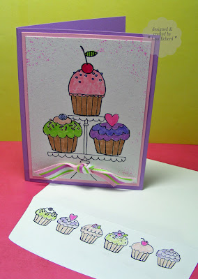
We've got a special birthday girl to send this one to soon. She loves hot pink and purple!
Project Notes:
- This great stamp set from Hampton Arts has oodles of great cupcakes, even a border to use on the envelope. However, I drew in the cake stand by hand with a black journaling pen before stamping.
- I forgot and stamped the border on the envelope in regular black ink rather than Staz-on. So I used colored pencils lightly and the black didn't bleed too much.
Ingredients: Stamps: Cupcakes by Hampton Arts; Itty Bitty Backgrounds by SU!
Ink: Black Staz-on, Basic Black, Bold Brights and Soft Subtles SU! markers, Pink Passion
Cardstock: Naturals White, Pixie Pink, Lovely Lilac
Wednesday, April 28, 2010
not meant to see
I CASEd this layout from BH&G Scrapbooks Etc. June Issue's Made in Minutes. It was made in minutes though minutes scattered over about 4 days :-) When you are really busy, it is especially nice to sneak in a little crafting time.
The layout is about our efforts to see a space shuttle launch - one of my hubby's wishes. After snagging very hard to get tickets, I thought the tough part was over. Unfortunately, this particularly launch was delayed 8 times. For 6 tries, we just kept postponing our trip. On the 7th, we and NASA were sure it was going to launch only to have it scrubbed just a few hours before lift off. We finally just had to come home. They launched about 4 days later. So I guess it was something we weren't meant to see.
Project Notes:
- With no DSP in patriotic colors, I colorblocked the layout with papers from two of SU!'s 6x6 packs (highly recommended as a hostess option) and one tone on tone paper from another paper pack in Brilliant Blue.
- I love undressed chipboard like this curved arrow so I can paint or ink in whatever color needed. The dark gray color was just black and white paints mixed.
Ingredients: DSP: Real Red, Sahara Sand, Jersey Shore by SU!
Font: Arial Narrow
Tuesday, April 27, 2010
TIPsy Tuesday - Ribbon Stretching
I'm stingy with my ribbon. Sometimes I'll wrap the ribbon all the way around a card and tie a big bow but not that often. Mostly I hoard my ribbon like it was gold. Here are some ways to make a punch with a little bit of ribbon.
Wrap the ribbon around one element of the card then tie twine around the ends to finish it off.
Place ribbon across entire card but taper ends rather than wrapping. Attach with glue dots.
Tie a bow and glue it on.
Tie a knot and glue it on.
Fold ribbon under a fancy brad. (This was a masculine card).
Have ribbon go across card but not be tied - the Baja ribbon in this case. "Tie" with another companion color - the black gingham
Tie two companion ribbons together - in this ex: Kiwi Kiss satin and Kiwi Kiss grosgrain stripe.- Use staples to attach small amounts of ribbon to a card. These were attached with Tim Holtz Tiny Attacher but I've often used a regular stapler:
And this card I made for a challenge last week uses the wide striped ribbon from Stampin' Up! I cut the ribbon in half lengthwise with pinking sheers. Then I only wraped the ends around the card. The card was finished on the inside with a liner paper.
Happy Tuesday! Thanks for stopping by.
Sunday, April 25, 2010
Lovin the Love Wheel
Loving this Love wheel from the Stampin' Up! mini catalog current through April 30. I waited until I knew I could sucessfully unmount wheels before buying. It makes them so much easier to use. And for $8.50 you get quite a stamp for the money. See this post if you want to unmount your wheels --> TIPsy Tuesday Unmounted Wheels
Project Notes:
- My unmounted wheel made it easy for me to use an ink cube for coloring the main stamped image and also use markers to get the colors on the heart in square design.
- The chipboard is inked with craft ink for that spongy look.
Thanks for visiting. Hope you have a great week!
Ingredients: Stamp: I Love Love wheel from Stampin' Up!
Ink: Scarlet Jewel from PTI; Ruby Red, Cameo Coral from SU!
Cardstock: Blush blossum; burgandy is an unknown source
Chipboard: Stampin' Up!
Ribbon: Scarlett Jewel form Papertrey Ink
Saturday, April 24, 2010
Ways to Use Pattern Paper
Talk about a perfect challenge - use pattern papers! To make this one from Splitcoast (WT267) a little more of a challenge, I made myself...
Project Notes:
- select pattern papers from different paper collections so they didn't automatically coordinate.
- select papers that did not have the same colors as any of the other papers
Project Notes:
 The design is CASEd from June 2010's Scrapbooks Etc. magazine. They have a feature on cards. Check it out, there are some good designs.
- Rub-ons help fit a sentiment into a small space on the scalloped paper.
- The ribbon is cut in half. There will details on saving ribbon in next week's TIPsy Tuesday.
Here's another with just a couple of changes...
Ingredients: DSP: Nook and Pantry by Basic Grey, Thrift Shop by Oct Afternoon, 365 Degrees by Pink Paislee
Cardstock: Kraft, Choc Chip by SU!
Rub-ons by SU!Marker: Chocolate Chip
Thursday, April 22, 2010
teach

Lenny had an opportunity to return to the classroom for a day in March. Many years ago he did a stint as a full-time high school math teacher after subbing for a couple of years the first time he 'retired.' It was a challenge to say the least. "There were just so many things they didn't tell me before I took the job," he kept saying. Yeah, no kidding. If they had told him everything, he would have run for the hills. Teachers are way underpaid.
His recent return to the classroom was much different. He did a session in a program called "Technology Talks" for a local college. His segment was on the Nintendo Wii. He explained how and why you might want to use the Wii for games and mostly for exercise. I helped him out a little and one thing that was the same between this and high school classes - you sure are tired at the end of the day! He did say he would do this one again, though.
Project Notes
- The little Wii character (Mii) was generated using a website where you build your own Mii. I then screen captured it (Print Screen and pasted into Paint) and printed.
- The journaling was printed directly on the 12x12 Kraft paper first.
- 'SHARE' is stamped off in Soft Suede to lighten the look. Soft Suede - soon to be a regular color at SU! - is great with Kraft. Also, Kraft will be available in ink, too under a new name.
Happy Earth Day and thanks for visiting!
Ingredients: Stamps: Autumn Leaves
Ink: Soft Suede
DSP and Buttons: Delight by Fancy Pants
Cardstock: Kraft by Stampin' Up!
Chipboard letters: Offbeat by Basic Grey
Font: Problem Secretary Normal from dafont.com
Wednesday, April 21, 2010
More SU DSP cards
Project Notes:
- I used Creative Memories oval cutters to cut my shapes. The smaller shape is just the back side of the same DSP.
- The Cricut cut the flowers for me using SCAL software and that Sari's Flower font again.
Ingredients: Stamps: Mail Box Greetings, Text from PTI
Ink: Close to Cocoa; Antique Linen from Ranger
DSP: Green Tea (I think) from SU!
Cardstock: Naturals White
Ribbons: Old Olive and Ivory taffeta from SU!
Button: Baja Breeze from SU!
Tuesday, April 20, 2010
TIPsy Tuesday - Easy Wood Grain
Thin dark brown paint slightly - not too thin or your chipboard will warp. Brush onto plain chipboard with a somewhat rough paintbrush - one that has been used a lot. You'll get a nice grainy look.
Old paintbrushes - that's another way scrapbooking let's you repurpose stuff!
One quick project notes:
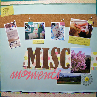
- The cork is leftover from my tumbled tile coaster projects. It's just shelf liner from Lowes Hardware.
My goal for this layout was to use some of my older stash. I think everything on this layout except the ink is at least 2 or 3 years old. Thanks for stopping by!
Ingredients: Stamps: Polka Dot Punches, Office Accruement by SU!
Ink: Soft Suede
DSP: My Mind's Eye
Embellishments: Oriental Trading
Chipboard: Unknown source (I've had it a very long time.)
Monday, April 19, 2010
Stacking Storage Drawers
These 12x12 three drawer units from Wal-mart are wonderful for keeping matching papers and embellishments together in one place. The drawers actually hold paper a little larger than true 12x12 so all my pattern paper has fit just fine. Each drawer is removable so I just take the entire drawer over to my work table when I'm ready to use a particular collection. I had two of these units and he got me two more. If I catty-corner them, I can fit two stacks in my closet and still open and close all drawers and doors.
I write the cardstock colors that match a collection on a piece of scrap paper and clip them to the drawer front. Then it is easy to find what matches without pulling out all my cardstock.
Thanks for stopping by. Be sure to visit tomorrow for TIPsy Tuesday.
Saturday, April 17, 2010
Mother's Day round card
Project Notes:
- The flowers were cut with SCAL software using a Dingbat Font - Saru's Flower - downloaded from Dafont.com.
- The center flower is cut in Very Vanilla cardstock and stamped with a wordy background stamp.
- To stretch out the last of this pretty ribbon, we used a piece just wider than the card and tied off with cream colored string. It is attached with glue dots.
Ingredients: Stamps: Polka Dot Basics, Background Basics Text by Papertrey Ink
Ink: Antique Linen by Ranger; Certainly Celery, Cameo Coral by SU!
Cardstock: Certainly Celery, Cameo Coral, Very Vanilla
Ribbon: Fabric store
Button: Certainly Celery by SU!
Friday, April 16, 2010
a good read
I've been very busy this week doing my regular job. I'm so happy to have new customers as well as regular clients sprucing up their homes!
 Of course, more work means less play time so I haven't made many cards or any pages this week. I did print out some photos from a Project 365 page and that is as far as that has gotten. I've also been cutting papers for Stamp Class on Saturday.
Anyway, the book looks at the lives of two sisters who went into foster care at the same time and ended up on very different paths. They are reunited years later when both need the other's support. I don't have siblings so I'm always intrigued by these relationships.
I picked up a book of John Grisham short stories, Fort County, at the library this week. His characters are so real; however, I'm not going to read it before bed tonight. You wouldn't believe the dreams I had last night - chilling. Guess I'll just have to browse some blogs before bedtime :-)
 Of course, more work means less play time so I haven't made many cards or any pages this week. I did print out some photos from a Project 365 page and that is as far as that has gotten. I've also been cutting papers for Stamp Class on Saturday.
 Did want to share a book I read recently - Once in a Blue Moon by Eileen Goudge. I've read most of her other books. Many are set in Northern California. We are planning to visit friends there later this year. It is such a charming and beautiful part of the country.
I picked up a book of John Grisham short stories, Fort County, at the library this week. His characters are so real; however, I'm not going to read it before bed tonight. You wouldn't believe the dreams I had last night - chilling. Guess I'll just have to browse some blogs before bedtime :-)
Thursday, April 15, 2010
Gearing Up
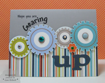
Here's a card going in the mail soon to a special little guy in our lives. The paper is part of My Mind's Eye Lil' Robots collection. I wanted the stripe because I thought it would be great colors and decided to get the little gears too just for the fun designs. As soon as it came - like the same day! - I was cutting out these little gears and putting together this card. The Cricut did "up" for me and I printed the greeting from Microsoft Word. On the inside it says "for a BIG birthday."
There is no stamping at all - just great DSP! This paper goes great with many Stampin' Up! colors, too.
Ingredients: DSP: Lil' Robots from MME
Cardstock: Going Gray from SU!
Font: Andy
Wednesday, April 14, 2010
Cherish Each Day
Project Notes:
- The flourish is stamped in Blush Blossom craft ink and then embossed. I used Stampin' Pastels to add a little Ruby Red and Cameo Coral working from the darkest in the center out to the lighter shade.
- I'm not sure about this punched border. I was playing with an old Papershapers punch. The white on red was too stark so I added more pastels to soften the look a little.
- Build-a-brads really make the simpliest stamped image classy.
Thanks for dropping by!
Ingredients all by Stampin' Up!: Stamps: Baroque Motifs
Ink: Ruby Red, Blush Blossom, Close to Cocoa and Cameo Coral.
Cardstock: Ruby, Cocoa, and Blush Blossom for the base
DSP: Raspberry Tart
Tuesday, April 13, 2010
TIPsy Tuesday - What matches DSP
Maybe it is because I spend my professional life matching fabrics but when I'm scrapbooking or card making, I want my DSP and my cardstock to match as close as possible. To make it easier and mostly to use my crafting time as wisely as possible, I now check and note the cardstock colors that go with new DSP when it comes in or the first time I use a paper from that pack. No matter how good the light, and I love my Verilux desk lamp, natural lighting is the best way to match papers. But sometimes I'm working at night or other times when the lighting is poor in my room. Having the color matches already figured out takes out the guesswork. It also helps me see what papers I need to order from SU! or PTI. (Stampin' Up! cardstock has the colors already noted in the catalog so they make it really easy :-)
So I take my new designer papers and go through my Stampin' Up! and Papertrey Ink cardstock decks to figure out the best matches. Sometimes I pull out full sheets of cardstock. Then I note the colors that match a particular pack of DSP on the back of the paper pad or on a note I tape to the packaging. That's it. When I'm making a card, I know what is going to work and can pull all the paper out at once.
The paper deck I referred to is one I posted here -- Cardstock Reference Deck; Of course, now that Stampin' Up! is changing color families I'll need to redo this deck. As soon as we know the new 2010/11 In Colors, I plan to repost the deck file on Splitcoaststampers with a link here at the blog. It will include all the current and just discontinued colors for SU and Papertrey Ink as well.
Yesterday morning, I was making a wedding card for my stepdaughter using some Basic Grey Marrakesh paper with green in it. I didn't even have to check, my notes said Mellow Moss and sure enough it was the perfect paper.
Here are the colors (by my interpretation) that go with the new October Afternoon Fly a Kite 8x8 paper pad:
From Stampin' Up!
Bermuda Bay/Taken with Teal
Chocolate Chip
So Saffron and Summer Sun
Dusty Durango
From Papertrey Ink:
Spring Moss
Berry Sorbet
Dark Chocolate isn't bad either.
Neutrals are Brown and Ivory
I also have October Afternoon's Thrift Shop and here are the colors for it:
Riding Hood Red
Bermuda Bay
So Saffron
Neutrals are Black and Ivory
Another benefit to doing some matching up is you can see what papers you need. This is going to be especially helpful as I decide what discontinued colors I want to stock up on from Stampin' Up! in the next couple of months.
Happy Tuesday! Thanks for visiting!
Ingredients: Stamps: Big Flowers, All Scallops by Stampin Up!; Mailbox Greetings by Papertrey Ink
Cardstock: Bermuda Bay by SU!
Ink: Bermuda Bay, Riding Hood Red, Choc Chip by SU!; Vintage Cream by PTI; Signo White Gel pen
DSP: Fly a Kite 8x8 paper pad by October Afternoon
Monday, April 12, 2010
Project 365 - Update

Happy Monday. Thanks for joining me this week!
One of my New Year's resolutions was to do a photo every day for Project 365. With this effort, you commit to taking one photo per day and then scrapbooking them. The idea is to capture the little stuff as well as the big events of a year. I'm a quarter of the way through this project now and here are a few things I've learned:
- The world won't come to an end if you forget to take a photo. I have resisted (without too much effort) the urge to leap out of bed at 11:00 p.m. and snap a photo when I realized I'd missed one that day. It is sort of like dieting. If you slip one day, just start back the next. OK, it is easier than dieting. Fortunately, I haven't missed too many days.
- I've also decided it is OK to capture two interesting things from the same day. Particularly since it is Spring and so many things are changing in our yard and lives at this time of year, it is OK to snap quite a few different images. It sort of makes up for those days I forget to photograph.
- It is best to scrapbook these photos as you go. I can't imagine they would ever get done if I left them till the end of the year. This is actually one of the best parts. I have a quarter of my 2009 album done! That has never happened at this point in the year.
- I'm still a theme person. I try to take photographs of random stuff each week but invariable start looking for themes. That is how we go the CHORES layout above.
Project Notes:
- To create the photo collage in PSE, I typed out CHORES in white and changed the transparency to 75%. I added each photo and then cropped with the marqee tool.
 The design was inspired by a layout in Scrapbooks, Etc. April 2010 issue.
- The waves were cut with a Creative Memories tool. I'm not sure it is still available. Every time I think I might list it on E-bay, I find a use for it.
- One of the circle designs was stamped with the Medallion background stamp in black pigment ink and then embossed. I then just cut out the center circle from this design and added the cork clock button.
- The other circle designs were typed in PowerPoint using the WordArt tool.
Ingredients: Stamps: Medallion, Trendy Trees, Polka Dot Punches from Stampin' Up!
Ink: Black pigment ink from Colorbox
Fonts: Andy, Book Aniqua, Honey Script
DSP: Crate Paper Mia Collection
Cardstock: Brocade Blue
Cork buttons: Pink Paislee 365 Collection
Saturday, April 10, 2010
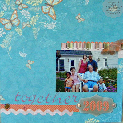
Together in '09 and SU! Big News
Rarely do I do a layout with only one photo and no journaling. I often see beautiful ones in galleries but I wonder what the story is. For me, scrapbooking is all about telling the story, capturing the memories of what you were doing and how you felt. This page will be the first of several I've already posted about the kids visit. So the rest of the pages will really tell about our week together.
The photo does tell one little piece of the story of that week. See my scabby knees. I fell on the day before the kids arrived for a week's visit and missed all the activities they did away from the house. I'll always remember little Nai Nai saying each morning, "Will you be going with us today, Miss Lisa?" I was just too swollen to walk very far. Fortunately, we did several things around the house, like "Christmas in July," playing dress up, making ice cream, picking zucchini (Nai Nai is crazy about vegetables) and playing games. I still got in on some of the fun.
- The Cricut and SCAL software cut out all the letters and the little ric rac type border. The border is made by using the tilde (~) symbol over and over again, squished together and then stretched vertically. You can make great borders in SCAL just with simple fonts.
- From a class at Two Peas, I learned from Nichol Magourik to use spray adhesive when applying glue to very delicate die cuts. Worked beautifully. To do this, lay the cutout - in my case "together" - face down in a cardboard box, spray with adhesive and then adhere to your project.
- As mentioned in an earlier post, KI Memories Enchanting grads look great with Stampin' Up! Sweet Pea designer paper.
Speaking of SU! ...BIG NEWS! Have you heard that Stampin' Up! is changing their color families. Many, many colors are going away, some old In Colors (sadly, not Kiwi Kiss) are returning, and some new colors are being introduced. They are bringing back Baja Breeze, yeah! Mary Fish has a great writeup with all the colors going and coming on her blog: http://www.stampinpretty.com/2010/04/stampin-up-gets-a-color-facelift.html
Ingredients: DSP: Sweet Pea by Stampin' Up!
Brads: Oriental Trading; Enchanting by KI MemoriesChipboard: Oriental Trading
Ink: Whisper White
Friday, April 9, 2010
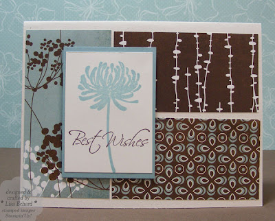
Sketch Challenge - Best Wishes
Here's my submission to this week's sketch challenge at Splitcoaststampers. I kept this card really simple and plan to use it for our next stamp class later this month. I often give them such time consuming cards to make that I thought we ought to have something quick to balance things out. Gives us more time to gab :-)
What I love about this layout is that you could easily duplicate it in a totally different look just by switching the DSP. It is perfect for coordinating papers.
Thanks for stopping by!
Ingredients: Stamps: Kind and Caring Thoughts by SU!
Ink: Baja Breeze, Chocolate Chip
Cardstock: Whisper White, Baja Breeze, Naturals White
DSP: Offbeat 6" paper pack by Basic Grey
Thursday, April 8, 2010
in the Watermelon Patch
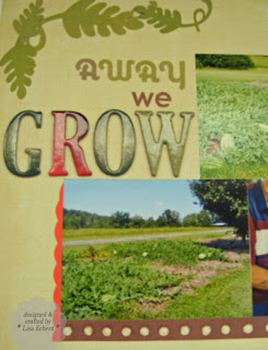
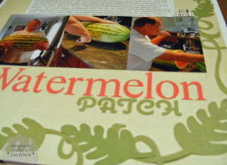
Lenny is very excited about soon sowing seeds for the 2010 watermelon patch. Last year's was his first and here is the layout I did on it. Journaling reads:
In the summer of 2009, Lenny announced that he had always wanted a watermelon patch. I agreed that he could plant watermelon and cantalope in the front flower garden since we weren’t ready for flowers. I bought some small seedlings at a garden center which he planted and didn’t water right away. After they died, he brought home seeds from Walmart and planted the whole pack! Soon a large part of a very large bed was filled with watermelon vines. Soon enough, the entire neighborhood began to talk about his watermelon patch. One of my friends even noticed it driving by! Lenny was so excited checking out the status of the melons each day. He was a little dismayed that his first melon got ripe while he was in Missouri. Not to worry though, he had plenty more. He had a few helpers in giving the watermelons away - everyone was sure he could not eat them all himself, but he gave it a good try. We weighed one in at over 50 lbs! “Why did we wait so long - we should have been growing watermelons for decades?” Lenny is excited about his 2010 patch to be in front of the shop and has started preparing land for many future summers.
Project Notes:
- To create the watermelon vine leaves, I used a leaf from Photoshop Elements and added a couple of extra "parts" - whatever the little leaf parts of a leaf are called? I also used PSE to draw the vine and then cut the pieces in different sizes on the Cricut using SCAL software. I used two different green papers to add some interest.
Ingredients: DSP and stickers: Lemon Grass from Crate Paper
Digital Grid Paper from Katie Pertiet
Font: Times New Roman
Chipboard letters: Sam's Club kit
Wednesday, April 7, 2010
It's never what you expect
Okay, I’ll admit it. I have a mild obsession with pattern paper. Well, more than mild, but honestly, there are so many pretty papers on the market and they are premiered twice a year and released more often than that. I can’t help myself. Yet, I’m trying.
After CHA (Craft and Hobby Association) show in January, I dogged the Two Peas website scanning all the new releases and putting favorites into my wish list. What I really wanted though were the October Afternoon papers so last week when they finally came in, I ordered. Apparently, I’m not the only one who fell in love with these designs. They are hot, hot products.
But before the October Afternoon stuff arrived, I’d piled up quite a stack of papers in my wish list. So to keep my little addiction under control, I limited my paper purchases to half my order total. That meant I was buying mostly the ones I craved the most. The rest of the order had to be embellishments, tools, stamps, anything but paper!
Funny thing is much as I love the paper I received this week, I think my favorite things from the order are in that other half – embellishments.
Here are my favorites and why:
October Afternoon Mini Market stickers: In Kristina Pick’s videos, Kristina (founder of Two Peas) got me interested in small stickers. There are lots of times I want to spell out “The” “And” and other small words along with my die cut or chipboard titles. I love the ledger background of these stickers. They could be used with anything!
Pink Paislee cork buttons: Honestly, these aren’t really buttons. I picked them because they were different and that was part of the point of making myself not buy so much pattern paper – to get some cool, unique stuff to play with. What I like most about these is the back of the package gives you suggestions on how to use them and embellish them further. Putting instructions or ideas on the back of a package is just good business. Why doesn’t everyone do that?
The backdrop for the photo above is one of the individual papers I purchased from My Mind's Eye Little Robot series. I also got the paper with the gear images and have started cutting it up. This is another thing I'd recommend for an SU! collection. This line goes beautifully with several SU! colors like Not Quite Navy, Tangerine Tango, Kiwi Kiss and Going Gray. Oops, I forgot, I wasn't going to talk about paper, was I?
Tuesday, April 6, 2010
TIPsy Tuesday - Watercolor Paper Dimension
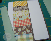 Another thing about regular dimensionals - it can take a lot of them to fill up a space. I would have needed probably 9 or 10 to do this card. Using scrap watercolor paper is economical and ensures the card won't get crushed anywhere in the center.
 Project Notes:
- This design is for Splitcoaststampers Clean and Simple cards challenge. The only stamped image allowed was a sentiment. I just wanted to use up some scrap designer paper.
- I marked vertical lines on my card base to guide placement of the little strips of scrap paper. The strips were 2" wide but only about 1 1/4" is showing.
- The watercolor strips are trimmed down to about 1/4" less than the aqua cardstock.
- I used Tombow Mono tape runner adhesive to hold the layers of watercolor paper and cardstock together.
Ingredients: Stamp Sets: Whimsical Words by Stampin' Up!
Ink: Chesnut Roan fluid chalk ink, SU! brown journaling pen
DSP: Basic Grey Nook and Pantry, October Afternoon Farm Fresh, MME for the solid aqua
Monday, April 5, 2010
The Joys of trying a different style
One of the many great things about papercrafting is you can work with a totally different style than you usually live with or wear. You don't live with most papercraft projects every day so it is fun to experiement.
Today's card uses Basic Grey's Offbeat collection - a "mod anthology" they call it. Whatever that is, it is fun and for me - a change of pace. So even if I did pull out my favorite little birdie stamp set, Cheep Talk, it gets a fresh look on these geometric prints.
Project Notes:
- First, I stamped the greeting so I could get the circle in the right place. Then, the circular shape in the yellow paper around the birdie was cut with a Creative Memories oval cutter.
- I cut the remaining shapes by marking lightly with pencil and then free hand cutting.
Ingredients: Stamps: Cheep Talk by Stampin' Up!
Ink: Prussian Blue and Chestnut Roan fluid chalk by Colorbox; SU brown journaling marker
Cardstock: Polar Mist by Paper Studio; Soft Suede by SU!
DSP: Offbeat by Basic Grey
Rimmed tags by SU!
Sunday, April 4, 2010
The Tulip Tree
Happy Easter! On Friday, I was refilling the bird feeder when I saw how beautiful our tulip tree was and went back inside for a camera. Funny, a couple of years ago I was ready to pull it up.
We've used the same nursery for our shrubbery since we first built our home. When we started, they asked us to bring along a simple drawing of the property and tell us what direction the sun came up. They also wanted to know what kind of plants we liked. Lenny only wanted plants that bloomed. Evergreen shrubs aren't his thing. Well, we did just a few of those so the house wouldn't be completely bare in winter but mostly, if it grows at our house it blooms sometime during the year. It was a few years into the project before we got to the end of the retaining walls and selected the camellia in the background of the photo for the front corner. I can't remember the name but it blooms three colors on one plant! It is now probably 12 feet tall and utterly gorgeous this time of year. (That reminds me I need to go cut some flowers to bring inside.)
For the back corner, the nursery owner recommended a tulip tree. "It has big pink blossums every spring," he says. That sounded fine to us; everything else he suggested looked and grew just great. What he didn't say was that you get the bloom early before the leaves. After the leaves it is just a regular tree. There are other trees like it - a dogwood for example flowers before the leaves come out. But for some reason, I've always found this tulip an ugly tree. The blossoms look so empty on the sprawling limbs all alone. We ought to trim it up, but I keep thinking we will just rip it up instead. That is until this spring, it really is full and beautiful even without leaves.
I'm not sure if there is a moral to this story. Maybe the tree is trying to teach me patience. Many people think I could use some. I keep telling my husband - who has the patience of 12 saints - that patience is NOT a virtue. But maybe the tulip tree is proving me wrong.
Saturday, April 3, 2010
Quilted Birthday Card

Combining quilting and card making? What's better! These little squares are all different papers from Basic Grey's Nook and Pantry paper pad. Paper pads are smaller versions of the patterns on 12x12 sheets so they are perfect for cards.
Project Notes:
- I adhered the squares with a single piece of adhesive in the center of each so there would be no adhesive on the edges where the sewing machine needle would go.
- All squares were cut the same size so I could play with the arrangement and adhered to a piece of plain white cardstock. I cut them down to size before sewing.
- Threads are tucked to the back with photo split adhesive.
- Vintage Labels from this years SU! Sale-a-bration sets fits great in this large Hodgepode hardware frame.
Ingredients: Stamps: Vintage Labels by Stampin' Up!
Cardstock: Naturals White by SU!
Ink: Close to Cocoa by SU!; Warm Red fluid chalk by Colorbox
DSP: Basic Grey Nook and Pantry
Hodgepodge Hardware by SU!
Ribbon from Stamper's Alley store in Mooresville
Thursday, April 1, 2010
Fresh Start
 For the cover this time, I went with all Basic Grey's Indian Summer DSP and stickers. I've been dying to use this part of a pointed square die cut free SVG file downloaded from the blog at SVGCuts.com. I love all those little holes in graduating sizes. Because I often fold the notebook cover over for writing, I have to keep the cover flat so stickers and die cuts are perfect. Just use lots of glue stick around the edges and they hold up great. Also this time, I used a few SU! rub-on's. But there is no stamping, just a little ink distressing.
 (I did photograph the process for getting the paper around the wires and promise to post the instructions soon. Unfortunately today, real work calls...)
I've always loved notebooks. There is something so hopeful about a notebook filled with blank pages just waiting to be filled.
Ingredients: DSP and stickers: Basic Grey Indian Summer
Cardstock: Papertrey Ink
Rub-on's Stampin' Up!
Subscribe to:
Posts (Atom)


