Pages

Tuesday, February 28, 2012

From Scrapbooker to Cardmaker: Distress Inks and Masking


For today's card, I'm using the old favorite stamp set, Lovely as a Tree, from Stampin' Up! I've used this particular stamp in silhouette before but this is the first time using a mask to create a distinct horizon line.

You may notice in the video that the cardstock for my stamped image seems to grow and shrink.  When I was filming the main part of the card, my camera batteries died and I didn't realize it.  Fortunately, it was near the end so I just had to redo part of it but ended up with a different size paper.  This worked out as it gave me more room for the greeting.  Later on I cropped the cardstock down so it looks like it got smaller, too.

Watch at YouTube


This is the last video I have planned specific to this series - From Scrapbooker to Cardmaker.  We've covered using scrapbooking supplies on cards, gettings started with stamping and a couple of techniques using stamps that work well for both scrapbooking and stamping.  I do plan to continue doing videos.  There are a couple of scrapbooking ones I recorded ages ago yet to upload.  So there will be more cards, pages and techniques - just my take on a few things.

Thanks for watching!  Ideas and feedback are always appreciated.

Ingredients:  Stamps:  Lovely as a Tree by Stampin' Up!  Greeting stamp from Kind and Caring 
Thoughts by Stampin' Up!
Cardstock:  Bashful Blue
Inks:  Dusty Concord, Tumbled Glass and 
Peeled Paint by Ranger; Pear Pizzazz and Not Quite Navy by Stampin' Up!
Ribbon:  Old Olive by Stampin' Up!
Designer Paper:  Beautiful Life by My Mind's 
Eye

Saturday, February 25, 2012

Deja Vu?


For 13 years we had a dainty kitty named Casey who was all girl.  She primped, she never met a lap should could not cuddle up on, she stayed indoors or on the porch never stepping into the grass if it was the least bit wet.  She learned early on the joys of the kitchen and the dining room taking treats as often as we would dispense them.  After we lost Casey, we got Jasper.

Two cats could not be more different.  The only thing they have in common is a united hatred of the vet.  Jasper saunters in from the outdoors, gobbles up his food and then flops down in the living room floor without even the slightest bath whereas Casey would groom herself from tip of ear to tip of tail after one bite.  Jasper never sits on your lap only cuddling up for a little love every two or three days.  As I said, he is all guy.

So when things started changing on New Year's Day, no less, we wondered if he had made his own resolution.  He hasn't started primping yet though he somehow manages to keep his pretty white fur clean and he still doesn't spend much time in the kitchen but he does want a little more affection than before.  Will he become a lap cat yet?


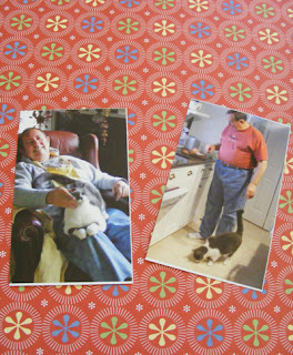
For the page, I was inspired by Glitter Girl's video on choosing paper colors that aren't an exact match to your photo.  In these photos I had Lenny in a rusty red shirt and a burgandy chair, but I wanted a brighter color palette so I selected this Stampin' Up! Ruby Red background paper with lots of other bright colors:


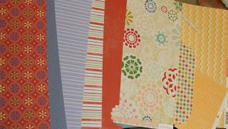
Here are the other papers picked after setting aside the photos and working from the printed paper:


For the background paper, I wanted a very light gray.  I'd had this pretty bird print paper forever and finally noticed that it had the perfect "B" side. I've got so many bird stamps, no need to save the A side anymore.


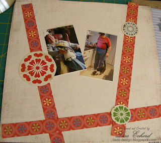
The general layout I had in mind...

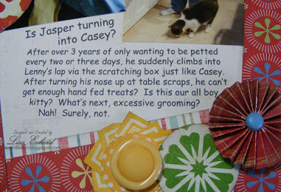
In the finished layout, I did several accordian flowers.  Here is a video I did on these quite awhile back:  Making Accordian Flower.


So, thanks to Glitter Girl, my layout has a more lively color palette than if I had just stuck to the photos. Wonder what scrapbooking dilemma she will solve next week?

Also, Bella Blvd has some great challenges going on this week.  I entered this layout in the challenge to use pattern paper to create your own embellishments.

Thanks for stopping by!

Ingredients:  DSP: background and small circle print My Mind's Eye; Red print from Stampin' Up!; yellow Winter Wonder by Bella Blvd; printed circles from Peppermint Collection papers by Crate Paper
Twine:  Doodlebug
Letters:  yellow are Niki Riki Thickers by American Crafts; other chipboard is raw Basic Grey that I painted

Thursday, February 23, 2012

Stripy Stripey Stampin' Up! card


Well, a mostly Stampin' Up! card.  Every time I think I want to break up the Sweet Pea paper pack from a couple of years ago, it gives me the perfect coordinated papers for a card or page.  This time I needed some masculine papers to go with this old fashioned wheel barrow from the Countryside stamp set.  My uncle has a birthday coming up.  He spends a lot of time in his garden in the summer.

The ribbon is Basic Grey and the greeting stamp is from Cloud 9.  All the other papers and the main stamp are Stampin' Up!  For the inside greeting I used a phrase I got from that same Cloud 9 stamp set:

"The good thing about growing old is that it takes such a long time--Walter Kemp"

I hope he will take it to mean that he isn't there yet.  There are always more years to go before we consider ourselves old.  I know for me 60, 70, etc. aren't nearly as old sounding as they used to be.  What do you think?  Is it a clever phrase or will it put him off?  He's an active 81 year old.  (I stamped it on a separate paper, I can always take it out.)

I want to thank all of you who responded to my "Have Faith" page earlier in the week.  Your warm wishes really made me smile and have a little more faith.

Thanks for your visit!

Wednesday, February 22, 2012

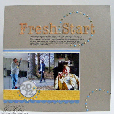
Fresh Start


We received a letter yesterday from a dear friend in England.  She wondered if it was too late to wish us a Happy New Year.  Certainly not!  I was just finishing up our page about our New Year's Day so clearly I'm still focused on the New Year.  It is always a treat to get a letter - especially a real, handwritten letter! - from a friend.

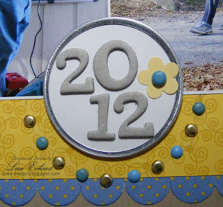
One of my crafting resolutions for the New Year was to use some of the Tools (including products) Techniques and Training Resources I had in my stash - things that perhaps have been overlooked for a long time.  I've used a lot of tools/products and revisited a couple of techniques.  For this layout, I pulled out some old training resources.  In this case, it was a 2009 Simple Scrapbooks magazine.  The scraplifted the arrangement of this layout from Julie Balzer.  Her layout had flowers peaking out around the 3 photo grid.  I subbed the paper strips and then added the three circles of brads. I've never done this with brads before but I've seen tons of examples.   My circle cutting system helped me get the right size circles as templates and then I pierced the holes. Inserting the brads turned out to be a good 'in front of the TV' activity.


The metal tag is one of those 'tools' or products I haven't used in quite a while either.


As for our New Year's resolutions, Lenny has organized several areas.  It is the keeping them organized that is the challenge for both of us.  I'm still working on 'savor.'  As you might have gathered from an earlier post this week, we 'worriers' spend too much time on the past and future and not enough in the present.  However, last night was the first night in a class on mindfulness that is sure to help.  It is one more tool to put in the toolbox to help with stress management.  The group is made up of a lot of people who want to handle their stress better as well as those who just want to get more out of their everyday lives, appreciating the little moments.  Sometime today I will do a 45 minute 'body scan' meditation.  We did this in class last night and it was interesting and didn't seem to last that long at all.     

Thanks for visiting.  How are your New Year's resolutions coming along?


Ingredients:  Cardstock:  Crumb Cake by Stampin' Up!
Letters:  Actopus to Zelephant by K and Company; Sunrise by American Crafts
DSP:  Decor Stripe by Heidi Grace for Fiskars and Candlelight by Bella Blvd 

Tuesday, February 21, 2012

Scrapbooker to Cardmaker: Working with Flourish Stamps


Today continues the Scrapbooker to Cardmaker series. Last time the videos talked about stamps and inks you might start with if you are new to stamping.  If you are new to stamping or just want to make a card, there is a video link below.

Few things are as versatile as a good flourish stamp.  This card works with the large flourish stamp in the Baroque Motifs stamp set from Stampin' Up!  The video below goes through this card step by step.

I've used this stamp many times for cards here on my blog.  Here are links to a couple more:

This card uses the same stamps as above with some pastels thrown in.  You could use a soft distress ink if you didn't have pastels.


This one uses the same technique as the sample above except it is embossed with clear rather than gold powder.  It creates a tone-on-tone look in an usual color combo: 


Watch at YouTube


Here are some of the products used today:


Add a little flourish to your next card.  Thanks for watching!

Ingredients: Stamps:  Baroque Motifs; All Holidays (greeting) by Stampin' Up!
Cardstock: Perfect Plum by Stampin' Up!; Lilac by Papertrey Ink
Embossing Powder: Gold by Stampin' Up!
Ink:  Versamark
Brad:  Vintage by Stampin' Up!
Rhinestones:  Hobby Lobby jewelry department

Monday, February 20, 2012

Have Faith


Probably a high percentage of TMJ sufferers who grind their teeth are worriers.  I'm just guessing but it makes sense.  I'm a worrier and I get it naturally.  I remember often seeing my maternal grandmother look sad.  I'd ask her what was wrong and she would say, "I'm just worried, honey."  As a child I couldn't understand what she could have to worry about.  Now, unfortunately I get it.  She spent a lot of time on what might go wrong.  My husband is the opposite.  Hardly anything ever bothers him.  Oh, I wish I could be that relaxed.

Worry is helpful when it gets me motivated to do something that needs doing.  But once I've done it, then I no longer need to obsess.  It isn't very useful when I'm worrying about things I can't do anything about or things that 'might' go wrong.  That last one happens a lot.  I've always had a plan B and C for just about everything.  Just to prove a point to myself, Friday I jotted down all the things I could remember worrying about in the previous week.  For example, I was in one town when it dawned on me I had to find the title to my old van before the trade.  I had several errands to complete before I could go to another town where my safety deposit box was.  I kept thinking - "What if it isn't there, I haven't seen it in 12 years."  Well, of course, there it was right in the box.  A lot of mental energy was wasted.  Almost nothing on my list really happened.  Some of the worry got me motivated to head off a problem, but mostly it was a waste of time and a drain of energy.  What does go wrong usually isn't what I worried about anyway.

Most things work themselves out or I find the ability within myself or with help from others to deal with whatever the problem is.  It seems to me that worry is often an absence of faith.  Faith in myself, in spirit, in my family, in my friends, even in strangers.  So this page is a little reminder to hang on the stair landing - something I'll pass each day and maybe remember to lighten up a bit.  Have a little faith.

And I've been wanting to do one of those banner layouts that everyone is doing now :-), so...

For the layout, I took up Glitter Girl's challenge (2P's) to use some of my chipboard. That isn't too hard as I love, love, love chipboard.  In this case, I'm working through a bunch of tags - some were raw and a couple already had printed finishes. For the raw ones, I painted them white and stamped them or painted white  metallic finish.  All paint is Anitas from Hobby Lobby.  Typically, I do my titles with each entire word out of the same Thicker.  This time I chose different ones for each.  The flags are cut from various pattern papers and sewn on.


This photo is over a year old.  I had some other idea for it that I can't remember but it works great here.  I love this background paper from K and Company.  I have a Stampin' Up! set with each image made up of dots that really coordinated.


Lately I seem to be putting rhinestones on everything.  I just love them.  They are cheap bling.

So here's to a little faith that you have a great day and join me tomorrow for a card and a video.

Ingredients:  Stamps: Polka Dot Punchs by Stampin' Up!
DSP:  Sweet Threads by Basic Grey; Geo Floral by K and Company

Sunday, February 19, 2012

Layered


Today would be a good day to bundle up in layers if I were going to leave the house.  It's snowing!  Just a little bit anyway.  It's our first of the season.

This card is bundled in layers, too.  I wanted to play with the new Stampin' Up! SAB designer paper.  I didn't get the stamp set that goes with it so after going through every flower set I had, I decided something non-floral would actually be better.  The paper has some tiny birds mixed into a lot of the prints.  This bird is from Inkadinkado and he is one of my favorites.  I stamped it in Versamark and went over in pastels.  Pastels are so forgiving as I didn't have the exact colors of the paper but no matter. They blend.

The frame is cut with the Cricut and the Storybook cartridge.  I stamped the background to help it blend with all these busy prints.   A couple of the prints are punched with border punches per the Ways to Use it challenge at Splitcoaststampers this week.  Haven't done one of those in ages. It was nice to play along on a good card making day.

Thanks for visiting!

Ingredients:  Stamps: Birds Galore by Inkadinkado; One of a Kind by Stampin' Up!
DSP:  Everyday Enchantment by Su!
Cardstock:  Pool Party by SU!
Twine:  Lime Twist My Mind's Eye
Lace: Making Memories

Thursday, February 16, 2012

So worth it


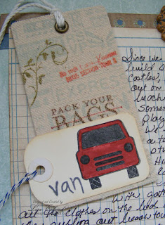
Here's what I like about this layout:  The subject matter.  I took this photos of our preparation for going to the beach.  We go through same routine every year and it seems like we take half the house for a week's trip.  We bike, sometimes play tennis and spend time on the beach so there is a ton of paraphernalia to make all the happen.  We've got it down to a real science just how much we can pack into my van.


I also like the embellishments.  Since the photos had so many different colors.  I picked the embellishments first and then chose the paper to go with them.  The little 'van' is from a Fiskar's stamp set I got at the dollar store.  I'd never used Fiskars before, they ink wonderfully.   I like the Pink Paislee paper also.


The layout is from a great sketch over at Artfuldesign. Check it out and if you have a chance to create a page in the next few you might win her March kit.

Unfortunately, despite having lots to like about the page, I just don't care for the way it turned out.  I think the photos were too big to start with and I never really overcame it.  I'm not crazy about my handwritten journaling though that doesn't seem to bother me so much here. Maybe it is also because I flipped the sketch over putting the circular elements on the bottom.  I also made it asymmetrical.  It was a terrific sketch in the original form.  I'll have to see what the other posters did with it.

Something here just doesn't work for me.  Yet, I'm leaving it as is.  I've captured the story.  Every page doesn't have to be my favorite.  Sometimes you just need to move along.

Now moving along...it is a very relevant page though as this year we will be packing up a different van.  We brought home our new Honda Odyssey on Valentine's Day!  I'm both happy and a bit sad.

I'm sad because for the first time in my life I'm not owning and driving a Ford.  I have loved my Ford's.  I'm very proud of Ford for not needing or taking a bail-out and for the upturn in their business.  Unfortunately, Ford no longer makes a minivan and I have to have one.  In order to haul the window treatments I make, I've got to have at least 7 feet of straight space in the back and even more room from the back up to the dash for longer treatments.  Last fall I had a 12' rod in my old Windstar.  It went from the back corner to the windshield but it fit along with the draperies and the ladder so everything went in one vehicle, one trip.  Without going to a really big, super expensive SUV, a mini-van is a must.

We narrowed the choices to Honda and Toyota.  The Honda suited me a bit better when I drove it and the seats were easier to let up and down. It really came down to little stuff.

I'm very happy to have the car buying process behind me. If nothing goes terribly wrong, I keep a vehicle 12 years or so.  I just can't imagine why anyone wants to put themselves through that game-playing negotiation process more frequently.  (shudder)  Very happy to have that done.

Now for the color.  Color always comes down to a process of elimination.  It seems most automakers have embraced Henry Ford's mantra, "You can have any color as long as it is black."  Today you can amend that to black, white and silver and you almost have all the choices.

My first car was in fact black.  I kept it for 13 years. My first van was a beautiful blue which I loved.  However, it had an unfortunate altercation with a utility pole so I had to replace it. The blue was no longer available in the model I wanted so I chose the only non-neutral available and got red.  I liked it and so, apparently, did a lot of other people. Even in my little town, I could not go into the Walmart parking lot without scanning about 3 other red minivans at one time to see which was mine.

This round also got down to one non-neutral color.  Honda makes a beautiful blue but not in the base model (I'm a no frills person when it comes to vehicles.)  So that left me with (you guys are so smart, it's in the red family)...

Dark cherry pearl.  Think Bravo Burgandy with a coat of Glossy Accents.  The interior is a perfect match to Sahara Sand. Yes, I really did take my cardstock sample deck outside and see what matched.  Am I a little too entwined with my hobby?

So now to get used to a new car and air out that new car smell that gives my husband a headache. Seriously he refuses to even ride in it for the next few weeks.  I guess I'll just have to do all the driving.  Oh, what a tough job.  :-)

It's the base model but it still has a lot of stuff I've never had before like a CD player, a passenger door on the driver's side, and power driver's seat.  Yeah, I know the rest of the world has had that stuff forever, but it is new and fun to me.

Thanks for visiting!

Ingredients:  DSP and cork accents:  365 Degrees by Pink Paislee
Brad:  Vintage by Stampin' Up!
Tag: Making Memories
Letters:  The Girl's Paperie 

Wednesday, February 15, 2012

Orange you glad I love color?


Here is one of the cards we did at Monday evening's card class.  The Basic Grey background paper inspired the choice of stamps (Kindred Spirits a retired set from Stampin' Up!) and the die cut.  I cut the white branch and the shaped piece using the Storybook Cricut cartridge.  It is such a versatile cartridge.

It is funny that I used to really dislike the color orange.  You still won't find it in my wardrobe as it just doesn't look good on me but you will certainly find it on my cards and scrapbook pages.  It seems to pair up with so many colors, in this case magenta.

One thing I'm not is a neutral person.  We have our new van!  Can you guess what 'color' I picked? (No, it isn't orange even if that were possible, I don't think I'm ready for that.)

I'll post more about it tomorrow as I have a layout to share that sort of goes along with having a van.

Thanks for visiting!

Tuesday, February 14, 2012

Everyday Love


Happy Valentine's Day!

Typically, I do a tip on Tuesday and have been doing the Scrapbooker to Cardmaker series.  I'm taking a break this week in honor of Valentine's and also to help me get caught up on some other projects. I plan to have another card making video next Tuesday.

Today I have the title page layout for our 2011 album.  I'm submitting this to the Scrapbooker's Anonymous challenge this month to use 3 hearts and some stitching.  You have to look close for the stitching but it is there around the inside edge of the floral paper.  It is often hidden by the curled paper.

Actually, I do have a little tip.  If you are planning to curl the edges of your paper, mist it first.  Using water has always been helpful but this is another way to use the glimmery mists on the market.  I spritzed mine with Tattered Angels gold mist and got a little glimmer as well as making the paper easier to handle.


The three chipboard hearts have been in my stash forever.  They were from Oriental Trading company, I think.  I painted them with various mixes of acrylic paint.  I just like throwing a bunch of shades together to see comes out.  Then I masked a center section and stamped them with a woodgrain stamp.  I stamped the center section of each with a different design.  I coated each entire heart with some homemade shimmer paint with just a touch of red tint.  Then I got to have some fun dressing them up with embellishment.


The paper was too busy as a background for my title so I brushed a little paint over that too and added just a touch to the lower right corner to balance it and tone everything down.


The photo was taken last Valentine's Day. I remember we were so happy to be out of the house as it was the first day warm enough for a walk in a very cold, snowy winter.  This year is the opposite as we have had marvelous weather until now.  Maybe that old groundhog really does know something after all.

I'm showing my hubby the album today. He has seen some of the pages as I've went along but not all. It is always fun to go back through the year together.

Thanks for visiting!


Ingredients: DSP:  Quick Cooking Barley by Jillibean Soup
Letters: Sunrise and Patchword Thickers by American Crafts
Rhinestones:  Bazzill
Ticket:  Je t'adore by Making Memories
Brad on the right:  Vintage by Stampin' Up!

Monday, February 13, 2012

Happy Valentine


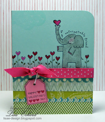
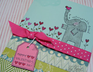
I told my friend this might be the only non-partisan elephant she would see this year.  :-)  He doesn't want to be elected to anything just to wish her a very happy Valentine's Day.

This set is an old one from Stampin' Up! I got second-hand.  I like to get seasonal sets that way as I don't do a lot of holiday cards.

Hope tomorrow brings you lots of love from all those you care about.

Thanks for visiting!

Ingredients: Stamps:  Happy Heart Day by Stampin' Up!
Cardstock:  Aqua Mist from PTI
Ribbon:  Melon Mambo by SU!
DSP:  October Afternoon and Crate Paper Peppermint

Saturday, February 11, 2012

Cardstock Reorganization


Finally finished with my cardstock reorganization project.  All of my cardstock now has a drawer!  Here is the new system.


Here is the old system.  The cat isn't 'stored' in the closet.  He is an optional embellishment.

This wasn't bad.  I had the cardstock organized by manufacturer and color family in clear plastic envelopes with a label on each one and labels of the color family on the side of the wire shelves. The problem was the envelopes were getting really stuffed as my collection grew.  Unfortunately, with Stampin' Up! you have to buy single colors in 24 sheets of 8 1/2 x 11" paper.  It was getting harder and harder to see the right envelope with a quick glance and it just too time to pull them out and get out my paper, close them back up and refile again.

So... I got several more Sterlite 3 drawer stackable units and put all my cardstock in drawers.  I originally used these for designer paper.  I still have a bunch for DSP in another closet. (Here's an old post about those DSP in stackable drawers. I'm out of closets so this is it!  I'll have to stop buying or start using more if my drawers fill up!


Each drawer has a printed label for manufacturer and color family.  The colors are handwritten on pieces of the actual cardstock to make it easier to spot the right drawer in a hurry.  I did 3 or 4 colors per drawer for those I use the most and 5 colors per drawer for the lesser used.


Sterilite units are available at Hobby Lobby and at Walmart. I ordered one unit set for a total of 9 drawers from Walmart.com which is cheaper than the store.  I used Hobby Lobby coupons to finish out what I needed.  (They are $16.99 per unit at Hobby Lobby before coupon.) I love these because they are the perfect size for 12x12 cardstock and designer paper.  Plus, they are easily removable.  For designer paper or kits, I pull the whole drawer out and take it to my worktable.

Here's a quick video tour if you are interested:


A bonus of this project is that my hubby is using the old wire unit for storing his repaired pinball boards.  I'd even kept the cover so he is thrilled to get free rolling storage!

Thanks for visiting!

Wednesday, February 8, 2012

A Couple of Days


We packed in a lot of good food, conversation and visiting in a couple of days hosting friends at our house in November.

The leaves are chipboard I painted and then coated with some homemade shimmer paint.  I used gold Perfect Pearls from Ranger this time to give it a little extra glistening.


Thanks for visiting today!  We are still van shopping.   I hope to wrap it up soon.  If nothing happens, I keep a vehicle for 12 or 13 years so it is a big decision.  I'm excited now and ready to move things along.

Ingredients:  Chipboard: Stampin' Up!
Letters:  Thickers by American Crafts
Brad:  Basic Grey
Stickers:  Mini Market by October Afternoon
DSP: Sprinkles and Lace Sophisticates by Bella Blvd.; Pumpkin by Lily Bee and Marrakesh by Basic Grey

Tuesday, February 7, 2012

From Scrapbooker to Cardmaker: Start Stamping


Until now in the Scrapbooker to Cardmaker series, we have focused on ways to use your paper and embellishments on cards.  In these videos I talk about stamping products that work well on both cards and scrapbook pages.

Part 1 is the Stamps video with some ideas on what stamps work well for both. I've shared several scrapbook pages where I used stamps.  Also I share a few 'oops' purchases and how to avoid them.  I've linked the stamps in the video which are still available in the products below.  The only one I know are still available and are not linked are the flourishes.  These can be found at places like Amazon (which for some reason I couldn't get to link with the InLinz tool) and at the craft stores like Hobby Lobby or AC Moore.  If you like flourishes at all, look for Rhonna Farrer's collections by Autumn Leaves.  You will get tons of use out of them.

Watch at YouTube


Part 2 is on Inks.  Distress inks are common supplies now for scrapbookers.  You can stamp with these too.  Also, did you know that Stampin' Up! inks work a lot like the distress ones?  Also in the video are ways to get a good color selection without spending a fortune.

Watch at YouTube


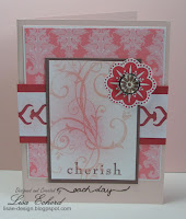
The card above was made with a set of stamps by My Mind's Eye.  I didn't realize that these are not available on-line anymore.  However, I've linked another set of doily stamps below from Papertrey Ink. MME has several new stamp sets out with their CHA Spring release already available for purchase.  They are a very good value.  I used a distress ink (Dusty Concord) to do some of the stamping on the card above.

Here are some of the products in my videos or similar products:


Flourish stamps:  Flourish Stamps by Autumn Leaves  (from Amazon)

Thanks for visiting today!
Related Posts Plugin for WordPress, Blogger...