Pages

Tuesday, July 31, 2012

Photos for guides


Here's a little tip I stumbled on accidentally thanks to my friend Karen.  I made these photos of our glads and e-mailed them.  She commented how nice it was to see the close-up as it showed the shadow detail for coloring stamped flowers.

What a great idea to put into practice this summer.  If you have some flowers blooming in your yard or at a park near you, snap a few close-ups to aid in your coloring.  

I have a tendency to just color the image darker near the center and get lighter as I go out.  I know this is very unsophisticated but my coloring is definitely basic.  Perhaps this little tip can help me create more authentic flowers.

Thanks for stopping by!

Thursday, July 26, 2012

Just Markers and Water


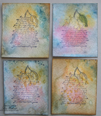
Happy Friday!  I have a few cards for today.  They are all a bit different but each had the same starting point.  All of these cards started with one of these images from the Faith in Nature Stamp set.


During one of our class lessons in the Stretch Your Stamps class, Kristina Werner used markers to add color to a craft sheet and then spritzed the color with water. She then dipped her stamped image into this mixture for beautiful results.  I've done a similar technique using Distress Inks several times and have substituted Stampin' Up! Ink pads as they are also dye inks.  I'd just never thought about using markers.  I love it!  With markers you can create a much smaller color pallette.  Perfect for a smaller image like this pear.  I used Stampin' Up! markers but I think any water based marker would work.

I did all of these with exactly the same colors except the one in the upper right corner.  It had a different shade of red/orange.  I also used some different distress ink on the edges. Otherwise, they all started with the same technique but came out so different.


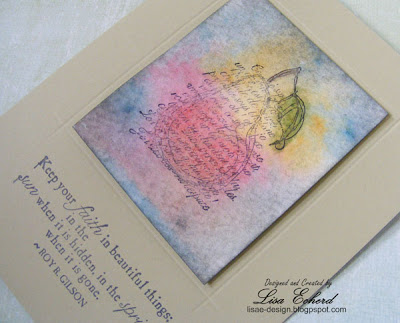
For the background of this card, I used a Hero Arts stamp that was inked in three different dye inks and then spritzed with water before stamping.


This is the simplest and one of my favorites.  I did use a colored pencil to add a little deeper color to the pear and color in the leaf after the ink dried.   I borrowed another class trick and used the scoreboard to mark a line around my image.  The lovely sentiment is the only other thing on the card.

These were such fun to do.  The pattern paper is the 6x6 Pyrus Paper Pad from Basic Grey.

Thanks for stopping by!  Hope everyone has a wonderful weekend.

Wednesday, July 25, 2012

Two More Vacation Layouts


Just a couple of odd layouts from our travels...

One person who enjoyed our train ride at least a little was Dillon.  He got to sit next to Grampa the entire time and plan their fishing expedition for later this summer.   Right now everything Grampa does is 'cool' (or whatever the current word is).  Wonder how many more years this will last?  We hope a long time.

For the layout, I used Pink Paislee's Prairie Hill collection.  I seldom buy the embellishments that go with papers.  In this case, I cut up some of the designer paper that had these kite tales.  It took awhile but was very easy.  Then I used some of the other patterns to make my own rosettes.  I did a video on this awhile back. You can see it here.


For the journaling block, I toned down a diamond pattern paper with some watered down white paint and then just wrote over it.  The layout got a good sprinkle of white paint to start with.  In the end, it all needed something to tie it together and my go-to is stitching around the edge.


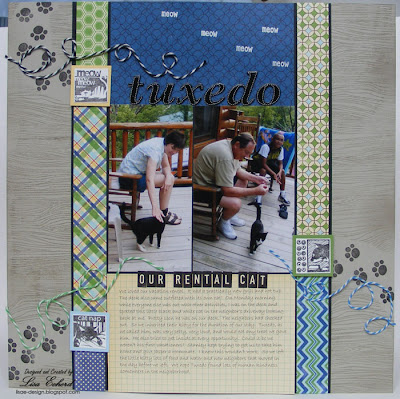
On our first morning of our trip , we had a visitor.  I spotted this little black and white cat in the neighbor's driveway.  They checked out that day.  It wasn't long before he took up residence on our porch.  He was very, very friendly and tried to get in the cabin at every opportunity.  We don't think we were his first vacationers.  He stayed with us and the last full day when some new people checked in next door, I saw him back over in their yard.  We enjoyed his company for a few days and he enjoyed all the treats he could get.


Lenny's son-in-law kept saying, "Jasper's going to get a roommate."  I assured him that wasn't a good plan.  Jasper likes being an only cat.

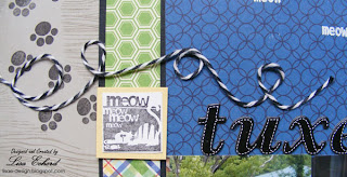
For the layout, I found these kitty stamps at the $1 store. I selected 3 of the inchies - (one about meowing, one about sleeping, and one about eating) and built a frame around the title, photo and journaling using the inchies and some kitty tracks for embellishment.  The Sahara Sand cardstock is stamped with a woodgrain stamp to mimic the deck where Tuxedo (as we called him) spent most of his time.  


A little twine added some flow and color.  The papers here are Macho Nacho from Jillibean Soup.

I think I'll break from vacation photos for awhile and do some other pages.  Thanks for stopping by!

Tuesday, July 24, 2012

Come to Bethlehem Finale


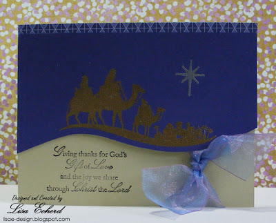
This weekend I delivered the Come to Bethlehem stamp set from Stampin' Up! to its new home where I'm confident it will be much loved and produce beautiful creations.  Last year I purchased this new set   and used it to make cards for my mother and my aunt to give at Christmas.  We used it in card class at least twice and I probably did some OWH cards as well.  So it has already been very active.


Before letting the pretty set leave my craft room, I decided to do one last card and filmed it.  There is an Oops!  I'm using Concord Crush paper which I said in the video is a SU In Color.  Correction:  it WAS an In-color.  I guess now it is an Out Color and has been retired.  You could easily substitute Elegant Eggplant or one of the navy colors.  You just need a dark background. Actually a simple designer paper would be pretty as well.


This card uses few materials and mostly cardstock so it is inexpensive to produce in quantity.  


Watch at YouTube


Thanks for watching!


Ingredients:  All materials except ribbon are Stampin' Up!  - Come to Bethlehem Stamps
Cardstock:  River Rock, Concord Crush
Powders:  Gold and Silver
DSP:  Concord Crush

Sunday, July 22, 2012

Stamping on Text


For our last lesson in the Stretch Your Stamps class, Shari Carroll created a card stamping a reverse stamp on text from a book.  I used some October Afternoon text paper and stamped my Hero Arts floral image in Baja ink.  This is a great way to use those text papers and give them a little more interest.  I was delighted to learn this technique as those kinds of papers often were left unused in my paper pads.


For the rest of the card, I added some fabric as trim for Two Peas CHA challenge and used several products from the Artfuldelight July kit.  There are Prima flowers and a canvas butterfly.  The butterfly was stamped with flourishes in Stazon brown.  Then I misted with two Mister Huey mists - Cameo and Water cooler.

CHA challenges end tonight over at Two Peas.  Check out the video section to see the new products.  I was both happy and dismayed to find so many pretty papers I liked.  (I really don't need to be buying more paper :-)  Thanks for stopping by today!

Thursday, July 19, 2012

Trust Your Instincts


How many times have I trusted my instincts and things have come out right?  How many times have I ignored my instincts and things have gone way off course???

My instincts are certainly not infallible.  Yet, like most people I do much better when I listen to that little voice.  That little voice is coming from those little clues.  In the case of one of our vacation activities, it was the video I watched on-line for the Great Smoky Mountain Railroad.  It didn't seem that scenic.  I rationalized thinking "well, they wouldn't show all the scenery on the video or you wouldn't want to take the trip."  When I told people we were going, there was this little hesitation when they said, "I've done that.  It was pretty."  There was never any "Oh, you'll love it!" kind of responses.  And then there was the cost.  It just seemed awfully expensive.  Well, I ignored my instincts.

When we got off the train and took the looonnng walk from the end of the train back to the station, my husband whispered, "please tell me we never have to that again." 'NEVER!' I said.

The rest of our party were very polite.  They didn't complain but the last night when I asked the kids what they liked the most about the trip, I heard "The Biltmore House" from one and "Tubing" from another. Then as kids do, they started going through their 2nd most favorite and 3rd and so on with the train as dead last.  Again, polite but we got the message.

So if you ever get the chance to go on the Great Smoky Mountains Railroad in Bryson City, NC, I say, pass it up.  If you are really into trains, you might enjoy it; otherwise there is far better scenery on the parkway for free.

So, why would I scrapbook this?  Well, we did spend most of the day on the train. There was some pretty scenery amongst the kudzu and I wanted another reminder to listen to that little voice - and not the one that whispers "a few more bites of chocolate won't hurt."  That is another voice entirely.

For the layout, I used Artfuldelight's monthly sketch.  You have until the 23rd to use the sketch for a chance to win a free kit.  The kit previews today.


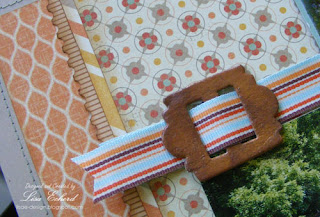
I painted some American Crafts undressed Thickers for the title and used the Cricut to cut the round embellishments.  For the buckle, I pulled the top layer off a K&Company one that didn't match.  Then I painted and then embossed it for an antique textured look.


This layout is also for one of Two Peas CHA challenges - Use your favorite collection.  I'm using Pink Paislee's Prairie Hill collection.  I just love all the papers both pattern and colors.

Have you ever been anywhere you would warn the rest of us to avoid?  
Thanks for stopping by!

Wednesday, July 18, 2012

Oh, the crafty opportunities


So much going on in our papercrafting world this week.  The Craft and Hobby Association's semi-annual show is going on in Chicago so the web is filled with videos of new product and many opportunities to win prizes.  I'm keeping an eye out for embellishments.  Currently I have a pretty good stash of designer paper so I want some things to go with collections I have.


Two Peas has a bunch of challenges, too.  My card today fits the first challenge to use a popular color scheme of shades of yellow, aqua and gray.

The card also fits in a lesson from the 2nd week of Onlinecardclasses.com Stretch Your Stamps class.  Monday's lesson was on flower stamps.  I used Kristina's technique for tightly stamping my flower stamp in a regular ink color and then adding a bit more color with a blender pen.  The image I chose is from Stampin' Up!'s now discontinued Fifth Avenue Floral.  This technique would work with pretty much any lined floral stamp.  The centers are touched with a bit of silver liquid pearls.

For the background, I used the Martha Stewart scoreboard to create a diagonal grid.  Kristina had also used the scoreboard to create diagonal lines.  Betsy from my card class reminded me that I could punch up the color on scored designs by brushing on a bit of darker ink over raised scoring lines.  The base is So Saffron and the ink color is Crushed Curry.

So with much help, I'm tickled with this card now on its way to a family friend who celebrates a birthday this weekend.  Happy Birthday, Ruby!

Also on Thursday of this week, Artfuldelight reveals the August kit a few days early.  She packs a ton of stuff in her kits.

Thanks for stopping by!

Tuesday, July 17, 2012

Color Block Card with Washi Tape


We had fun making this card last night at card class.  Washi is an easy an inexpensive substitute for ribbon on this color block card.  I've used 4 different coordinating pattern papers but you could use only two and still get a fun effect.  The Washi covers up the seams.

I've also used the new Lacy and Lovely set from Stampin' Up!  You could substitute any circular or scalloped stamp.  A flower would also be pretty at the intersection of these papers and tape.

Watch at YouTube


Thanks for watching!

Ingredients:  DSP:  Basic Grey Sweet Threads collection 
Stamps:  Lacy and Lovely by Stampin' Up!
Ink:  Dusty Durango, Rich Razzleberry, Basic Grey
Washi:  MME Indie Chic
Twine:  Doodlebug

Monday, July 16, 2012

Tubing


Oh, the fun they had!  Well, the kids had fun anyway.

I think the adults did, too, but you might not have guessed so if you had heard them.  "Oh, I'm so bruised and sore." "My neck hurts from having to hold my head up."  "That is hard on the wrists."  That was from only two adults.  The other two of us opted out.  Actually, I stood on the bridge and walked along the bank to get some good shots of the tubing adventure.  I kept thinking, this looks so easy I'll try it next time.   Hmm, perhaps not or perhaps on a milder creek.

Here's the journaling:


We asked at our check-in what they would suggest we do in the area.
Tubing at Deep Creek, she said. $3 per tube and it keeps the kids busy all day. Sounded so easy!
Turns out, the creek was both very deep and often shallow and rocky making for another adventure!

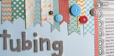
On the last day, Grampa, Jaime, Dillon & Nai Nai hiked up the trail at Deep Creek in the Great Smoky Mountains National Park to put in their tubes. On the first run, Grampa turned over right away. Nai Nai would often get stuck since she is so little. Miss Lisa stood on the bridge and took photos. It looked so easy, she might even try it on another trip. Everyone had a wonderful time and decided to make the day of it with a brief break for lunch and napping. On the last run, Dillon wanted to go to the very top where the water turned out to be the deepest and fastest as Grampa found out when he turned over again with the tube on top of him! The rocks were also the roughest as Jaime discovered when she fell out of her tube and slid down them. The kids sailed along enjoying all of it. Jaime was ready to follow the kids back up for another run when Lenny pointed out they didn’t have to – Adult Supervision!
Sometimes you really have had ‘enough fun.’


The last line about having "enough fun" is an old family joke. When Jaime was a teenager and getting on her Mother's last nerve, she told her Mother once, "I'm just having fun." Her Mother replied, "You're having too much fun!"   "But Mom, how can you have too much fun?"

I took nearly 20 years, but I think Jaime finally figured out, you really can have too much fun!


For the layout, I did more banners to add some color and tie into an earlier page in this series.  Also, I used a trick from the Stretch Your Stamps class.  Jennifer McGuire was showing how to use water for embossing by adding drops of water and then sprinkling on embossing powder.  If you work fast you can get those drops embossed.  She was sharing this for an emboss relief technique.  I used it here with white embossing powder to give the appearance of water splashing.


I also used a water themed stamp behind the journaling printed on vellum.


Thanks for stopping by. I'll have more cards as the week goes along and we continue on Stretch Your Stamps class.

Ingredients:  DSP:  MME 6x6 pads, Basic Grey PB&J, Amy Tangerine
Border Sticker:  Crate Paper Peppermint
Thickers:  Amy Tangerine for American Crafts
Stamp:  Fancy Pants

Sunday, July 15, 2012

Sentiment Background


One tip in our lessons from Stretch Your Stamps at Onlinecardclasses.com is to use your sentiment stamps as backgrounds.  Repeat the image and you get an interesting background.  I stamped "you" and a circle image repeatedly in Versamark on my little card to compliment the larger "You" in the sentiment.  I was also trying out Shari Carroll's water technique for the larger "You."  There are so many little tips in this amazing class!

All the images here are from Ali Edwards for Technique Tuesday.  I think this little card would make a good enclosure the next time I give a memory book gift.

Thanks for visiting!  I have several projects lined up for the coming week so I hope you'll stop by again.

Friday, July 13, 2012

Graphic Border and Alpha Stamps


Happy Friday!  I've got a couple more class cards for you today.

The circle border in this 'For the Birds' card is based on Kristina Werner's example in our Stretch Your Stamps class. She used a circle themed stamp and punched holes in the middle of the circles.  For my border, I stamped one circle image and the punched a hole in the center.  After doing a row of these and adhering them to a background paper, I stamped a smaller image inside the hole.  I really love the variation and dimension of this border.


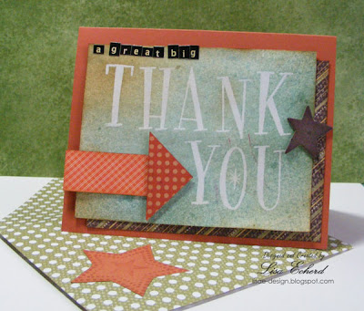
Alphabet Stamps are such a challenge.  They are one of those scrapbooking/stamping things I wish I'd left in the store.  However, there are a few in my stash so I need to make some use out of them. There were many great ideas in the class based on a very plain large alpha.  My alphas are either small or fairly ornate.  One of the ideas was to stamp a word in Versamark and clear emboss.  Then go over the image with mists.  I used the idea for this Thank You card that is CASEd from the class example by  Julie Ebersole.  I'll send as Any Hero mail in my next OWH box.


Anyhero mail goes to the troops for them - not to be sent back home.  We write a note of thanks or whatever we want to say to spread good cheer.  Since this came out a bit larger than normal, I did my own envelope.  Just loving that Martha Stewart Scoreboard.

Today's lesson is on sentiment stamps so I'll have something fun to tryout this weekend!  Hope you have a great summer weekend.

Thursday, July 12, 2012

Salsa Girl


This little girl can put away some salsa and chips.  Normally a slow eater, she goes through spicy food faster than the waiter can replenish it.  We all loved Rancho Viejo Mexican restaurant in Cherokee so much we went there twice on our vacation.

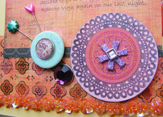
For the layout, I had selected these papers, stamps and trim to make a card but has so much stuff out, I thought it would do a great layout.  Then I found this perfect picture.


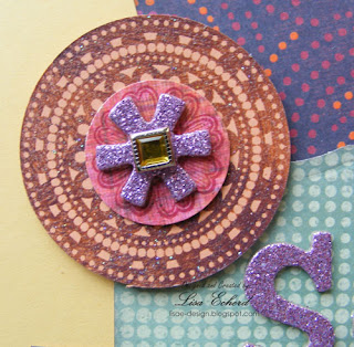
The circle embellishments are made with the Lacy and Lovely stamp set.  I stamped the base with craft ink and embossed with Irridescent Ice embossing powder from Stampin' Up! to go with the glitter Thickers.  The purple centers are the asterisks (*) from the Thicker set.

The papers are from K&Company and the fun sequin trim was a close-out at Hobby Lobby.

Thanks for stopping by!  I played with some of the techniques from yesterday's alphabet stamp lesson of the Stretch Your Stamps class but haven't made up a card yet.  I hope to catch up today or the weekend.


Tuesday, July 10, 2012

Collage Card


Each weekday of the Stretch Your Stamps class at Onlinecardclasses.com features a different type of stamp.  There was a supply list but we were encouraged to also use what we have.  I had just purchased quite a few Stampin' Up! sets and of course have many stamps so I didn't buy anything new.  The only category I didn't have a stamp for was the collage stamp.
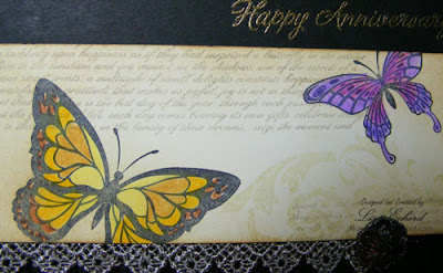
A collage stamp is one that has several elements like a flower over text with some other graphics - all on one stamp.  I never really got the point of buying a stamp like this.  Isn't it better to have the individual elements and do your own collage.  That said, getting a good looking collage can be challenging, at least it is for me.  I'm not always sure what works together.


In one of the videos, guest designer Amber Diagre showed how to create a collage look with butterflies and some script font.  I added a damask image to my version above.  She used colored pencils to color in the butterflies and I loved this idea.  No matter how hard I try, I just can't make a card or anything completely neutral.

I put the entire thing on a black card front with an embossed zebra stripe and some pretty trim I think came from Webster's Pages. This is going to be my parent's anniversary card as it just looks like my Mother.  I won't need it for a few months but it is nice to know it is ready.

Thanks for visiting!  Tomorrow is alphabet stamps.  I can't wait for those lessons.  Alphas are particularly challenging for cards, don't you think?

Summer Gift idea


After over 15 years of celebrating birthdays together, it is getting hard for my friends and I to find unique gifts.  We don't need things to sit around the house and if we do, we want to pick them out ourselves.  I took a cue from a gift my friend gave me years ago of a beach bag filled with goodies like nail polish, a beach read, a floppy hat, etc and got her some 'fun in the sun' things that everyone needs in the summer - sunscreen, lotions, nail polish, etc.  It isn't a glamorous gift but we can both appreciate practicality.

To wrap it up, I recycled a shopping bag that miraculously didn't have a logo and added a handmade tag.  I think the stamp set for this is from Fancy Pants.  I bought it ages ago from Peach Cheap and haven't used it that much.  To do the wave, I stamped in Versamark and then used chalks.

What good gift ideas do you have for long-time (notice I did NOT say Old) friends?  We like celebrating birthdays, but not getting older. :-)

Thanks for stopping by!

Monday, July 9, 2012

Spliced Background Stamp Image


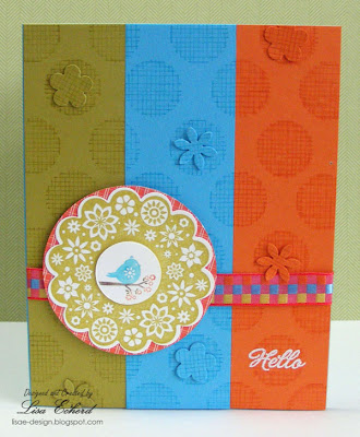
Today started the Stretch Your Stamps class at Onlinecardclasses.com.  I've used Kristina Werner's technique for stamping a background image multiple times and then cutting and piecing the parts back together.  For this circular design from Hero Arts, I just used simple strips to create my background letting my ribbon guide the color scheme.  

Each class has two videos and several guest designer projects for a particular type of stamp.  In today's case it was background stamps which are so versatile.


Jennifer McGuire is also an instructor and I used one the tips from her video today as well but I wasn't quite as organized as I thought and ended up with lots of leftovers.  I could have probably assembled another card.  Instead I punched some little flowers from the excess to add more dimension.

This card gave me a perfect background for the Four Seasons stamp set from Stampin Up!  There are large scalloped designs for each of the seasons. I'm sure the fall and winter ones will get much use in my cardmaking.  This one is I think the summer one.  There is a bird on a nest and bird in a flowering tree.  I decided the nesting bird would be spring.  Doesn't matter.  Anyway, he is paired with a bright color scheme for a summery card.

Thanks for visiting today!  Tomorrow I'll be along with a summer gift and packaging idea.

Sunday, July 8, 2012

Growing Up Title Page


Glitter Girls challenge this week is to use layers - lots and lots of layers to add depth to your layouts.  She gives wonderful examples in her video.  I also did a title page.  This one will be for my 'early years' album.

Now here is a challenge for you.  Find stickers for doing your own baby pictures.  Look through you stash and you might find things like "The most beautiful girl" or "Sweet baby" or "Precious daughter."  These are great for your own child or grandchild but for your own picture?  Not so much.  I really don't plan to do many of my baby photos anyway.  My Mother has her own baby book and as my title suggests I want to capture what I remember of my early years.

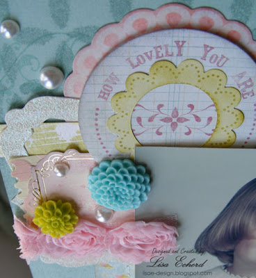
For this page, I did end up using one of those types of die cuts.  I swear I thought it said "How Lucky you are" not Lovely when I pulled it out and started the layout.  Anyway, I went with it.  One advantage of scrapbooking your own photos is you get to pick your favorite.  I like my photos up until about age 5.  When my permanent teeth started coming in, my ugly duckling phase began.  I had awful teeth that protruded and they were so afraid I would fall and break them out, I got braces when I was 10!  By the time my braces came off, my skin was a disaster and I didn't loose what would generously be described as 'baby fat' until my senior year in high school.  It may be a long time before you see layouts with those photos!  :-)

For layers, I piled on lots of stuff.


(I have fixed the spelling of 'remembering.')


Here are the layers I used in my layout:

  1. Misting with a Studio Calico mask and Mister Huey water cooler mist
  2. Several layers of pattern paper from Authentique
  3. Stitching
  4. Stamping across papers
  5. Die cuts from Making Memories Je t'Adorewith a little stamping and layering on one of the die cuts from My Mind's Eye
  6. Stickers from Crate Paper Pretty Party Book and MME Miss Caroline
  7. Trims from Webster's and JoAnn Fabrics
  8. Sculptured flowers from Prima
  9. Pearls from Stampin' Up!  Pretties Kit
  10. Letter stickers from My Mind's Eye Lime Twist Together alpha
  11. chipboard Thickers Forest
Glitter girl added some transparency and maybe some washi tape but I thought I had plenty.  It is a lot busier than my usual layouts but the photo is simple, it is a title page, and I kept the color palette to aqua, pink and a touch of lime.

Stitching, misting and stamping.


The edges of the photo curled so I just let them in keeping with the layers concept.

I'll have another layout later in the week.  Look for lots of cards on the blog this week.  Tomorrow starts the Stetch Your Stamps class at Onlinecardclasses.com.  I'm very excited to learn more ways to use my stamps.  We are looking forward to cooler weather this week so my craft room will be more of a retreat again.

Thanks for stopping by!

Friday, July 6, 2012

Before and After Rafting


After floating on the Nantahala,

the kids still look cheery but 

the adults are a bit weary!


I didn't go on the whitewater rafting portion of the trip so I took before and after photos to capture a memory of the day.   What struck me most in the photos is how Lenny and Jaime look a bit tired after their morning while the children are still ready to go.  Ha!


For the layout, I used washi tape around the border.  I've seen people do entire washi borders and they look great.  This was getting a bit busy so I just did a touch on each side.  The journaling is in a pocket behind the main photos.

The other photo was taken while we were on the train that runs by the river.  I just wanted to capture rafting in general.

Thanks for stopping by today!  Keep cool.


Ingredients:  DSP:  woodgrain from Peppermint Collection by Crate Paper
Washi:  Indi Chic by My Mind's Eye; Bazzill  


Related Posts Plugin for WordPress, Blogger...