Pages

Thursday, January 31, 2013

Two Pages and 15 Photos


For Project Life/Project 365, I saved up two weeks worth of every day events and put them on these two pages.  This was scraplifted from this page done in 2010.


The pages of the 2 page layout are sort of mirror images if one of the mirrors was upside down :-) I used the warm colors in the upper left corner of the title page and the lower right corner of the page with the journaling.  The stamped houses are from Hero Arts Whimsical Houses set.  I tried coloring them but that was just too busy with all those photos.


This ledger paper is stamped using a Technique Tuesday set and filled an empty corner.  The wood veneer and Washi tape update the look somewhat from the 2010 layout.

The details of the process are on my video on YouTube.


The sketch shown below is also in this PDF:  2 Week 2 Page Sketch


Feel free to use the sketch for your personal use.  A link back to this post would be appreciated.  

For the next couple of weeks, I'm focusing my photo taking on a typical day in our lives - capturing our routines in winter.  I thought I'd do the same in the summer and see what is different.  

Thanks for stopping by today! 


Wednesday, January 30, 2013

Tweet, Tweet, here I come!

I'm tweeting!

Now there is something I never expected to say.  But yes, I've finally given Twitter a try and to my surprise I like it.

Why did I wait so long and why am I surprised?  Well, I don't have a smart phone and I never really thought it worked all that well if you couldn't participate on the go.  Since I'm home most of the time, I can tweet using my computer and I'm still keeping up with all the crafty people I'm following so far just fine.

I'm surprised because what can someone long winded like me really say in 140 characters?  That's nothing - an introduction, a conversational detour but not really meaningful.  Well, again I'm surprised because you can get a meaningful thought out in a few words.  Maybe this Twitter stuff will teach me something and I'll get those videos under 10 minutes after all :-)

Most tweets have an attachment so you really don't need a lot of words, just a link to something else pretty, entertaining or useful.

In my first couple of days on Twitter, I learned that postage was going up so I bought more stamps, my favorite show General Hospital will likely continue past Sept of this year (Yippee!), and saw lots of cool projects linked in scrapbooking tweets.

Are you on Twitter?  If so, would you follow me?  I'll follow you.  I can see that this works best if you follow lots of people with common interests.

Most of my Tweets will be crafty in nature. I'll probably Tweet a couple of times a day with things I find on-line - interesting projects, sales, new product available.

Here's the link to my Twitter account - LisaEDesignNC

Thanks and have a wonderful day!

Tuesday, January 29, 2013

Picking Ink


Happy Tuesday!

Most of us don't have the space for every ink and paper color out there.  When deciding between two shades of the same color ink, go darker.  You can always stamp off and get a lighter shade.  For this card, I really needed Stampin' Up!'s Pretty in Pink.  I had Pink Pirouette which is very light and Regal Rose a darker shade.  I stamped off the Regal Rose and got an almost perfect match to my pink paper.


The stamped image and paper on the right is Regal Rose. On the left is the stamped off Regal Rose image along with a Pretty in Pink paper.  You can't tell it isn't Pretty in Pink ink.

On the other hand when choosing paper, I will usually go with the lighter of two shades.  I can always add color to paper with a background stamp or distressing.  Also, I prefer to use lighter colors for my card bases.  These are just my rules of thumb when I can't buy every pretty color.

Thanks for stopping by today!  I'll have a Project Life 2 page layout for you later in the week.

Monday, January 28, 2013

Always young at heart


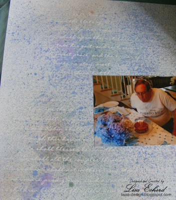
Seldom do I do a page without journaling.  This photo was pretty self-explanatory and I just wanted to capture the moment using some of my husband's favorite colors and convey the sentiment of the title.   I was inspired by the great pages of Ashli Oliver over at the Purple Mail Box blog.

I photographed my process so I could share and so I could remember what I did and probably because that is what Ashli does for her artistic pages.  Starting with some mistable paper from Stampin' Up! that has a built in design, I added a layer of mists.  I've used Mister Huey, one Heidi Swapp and several homemade mists:


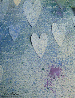
The handwriting shows through on the paper after misting.  This paper has been discontinued but I've seen similar products at Archiver's.  Next I added hearts cut with the Cricut as masks.


Another layer of mist:


Finally, I added some diecut hearts from a DCWV designer paper in the space left by some of my heart masks.


The white masks got a nice coating of mist and I've used them on this card:


It was a fun page to do and a bit of a change for my album.

Thanks for stopping by today!

Thursday, January 24, 2013

Collage stamp and Distress Inks


This Valentine stamp puzzled me.  It has a rose and some wording all together.  I couldn't color the individual components but one color seemed blah.  It was too detailed to emboss.  So now what?

You might wonder why I bought this if it was going to be a challenge. Well, it was at the dollar store and I don't have many Valentine stamps.  It seemed like an opportunity until I got it home and then went to use it.

So I got out my distress inks which work great with busy stamps and played.  This is what I came up with:

Watch at YouTube


I've used three colors all on the same stamp but alternating the placement of the colors each time.  It is very easy to do.  You do have to clean between stampings.  While I used distress inks, you could also use Stampin' Up! classic inks which are also a dye ink.

This was the favorite at this month's card class.  In the video I keep saying "Victorian Violet."  It is actually Victorian Velvet and a very pretty color from Ranger.

Thanks for stopping by today!  Hope you are staying warm.

Tuesday, January 22, 2013

Working your Pattern Paper designs


I love pattern paper.  (No kidding, right?) Despite all my stamps and the new masks I've been buying to do my own designs, I just can't resist pretty paper.  One of my favorite things to do with pattern paper is to cut along the design either in a border or to cut out elements for embellishment.

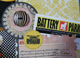
I also love to have the elements of my page support the story.  Designer paper can help with that. In this layout, we visited a coffee/wine bar and shops in 1920's era building.  I selected papers and those great Cosmo Cricket buttons that reminded me of the era.


The business card is from one of the places we visited.  It includes the name of the area and the colors match perfectly - just luck on that one.

Here is the journaling.  The font is Harlow which reminds me of this 20's era.


So today's video uses this sketch and focuses on how to use the designs of your paper and reinforce your page's theme:


This PDF contains the sketch and some other tips --  Scrapbooking Page - Making the Most of Pattern Paper

Watch the video at YouTube or here


Note about Project Life:  I'm saving up my photos to do a two week page and post the page and video next week.  So keep snapping away and stay tuned...

During CHA last week, I watched a lot of the product videos.  My favorite new collections of paper - not that I need it but you can tell I won't be able to resist - is My Mind's Eye Collectible series.  Do you have a favorite pattern paper company?

Thanks for visiting this week!

Monday, January 21, 2013

Thank you stash


Hi!  Hope you had a wonderful weekend.  I was very busy around the house.  Every few months, I cook chicken and make a bunch of homemade stock for the freezer.  So far (knock on wood), my husband and I have escaped the colds and flu but I wanted to be prepared in case I need some soup and some easy meals to put together.  When not in the kitchen, I was in the craft room.

My "thank you" card stash was getting very bare so I made a few cards this weekend.  For these two, I used several shades of green paint on a Hero Arts background stamp and then applied to a couple of different pattern papers.

For the blue/green flower, I stamped an image from Stampendous on pale blue cardstock and cut it out.  Then I brushed on a mixture of Glossy Accents and Tumbled Glass ink - just a couple of drops goes a long way.

For the other card, I used some Prima flowers and trim with a simple message.  This all sounds very fast but I have to admit it wasn't.  I hemmed and hawed and tried all kinds of combinations before I was happy.  Still it was a fun and a break from standing in the kitchen and my stash is restored.

Thanks for stopping by!

Friday, January 18, 2013

Mask and Pastels


My friend Karen got me this mask from the Crafter's Workshop and it's been hanging around my worktable for a month waiting on me.  So finally yesterday, I put it to use.

For this winter birthday card, I first went over the open areas in the trees with the Sahara Sand marker from Stampin' Up!  Then I used pastels on the background working from the bottom up and finally misted it all with a homemade mist of Baja Breeze ink and Perfect Pearls for a little sparkle.


I was delighted with the serene look. Hope you have a crafty weekend.  Thanks for visiting today!

Wednesday, January 16, 2013

Project Life, Project 365 - Little Wins


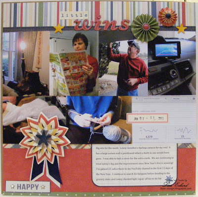
During the 2nd week in January, we crossed some things off the to-do list and celebrated some little wins - a couple of which can pay off in a big way.

My husband installed a backup camera in my van.  Yippee!  A factory installed one was not an option when I traded.  There were some cords to conceal so I knitted a cover for them as we needed something flexible and neat to go around them.  This is a win for me as I have only recently tried knitting again.  Crocheting, which was my passion in my teens, really bothers my right hand, but apparently I can knit without any issue.  So I've done a couple of very small projects.  It has felt good to have yarn flowing through my fingers again.

One of the photos shows my husband's leg in a garbage bag.  I know that looks weird.  For the last 3 winters he has had some type of dermatitis and after 3 doctors, we finally found one who knew instantly what the problem was.  A couple of expensive creams (including wrapping the leg for awhile each evening) and he is almost completely healed up.  We are so very pleased.

So to celebrate our little victories of the new year, the page uses accordion flowers like a 'blue ribbon.'  Originally I was going to do stars but when I was watching CHA videos I saw that some of the paper companies are bringing back these flowers in their embellishments.  I did a video on this a couple of years ago and it is linked below.

For this video, I'm way over my planned time. Most of that extra time is on the flowers.  The flowers are from 6 minutes in to 14 minutes in.


Watch at YouTube


Here is the PDF file with the sketch -->  Project Life Week 2 Sketch and Tips

And here is my first accordion flower video.  I'll probably do another one now that I've had so much fun doing these with chevron paper.

Watch at YouTube


If you are doing a photo a day, how is it going?  Are you enjoying capturing these little slices of life?

Thanks for watching!


Tuesday, January 15, 2013

To Mist or Not to Mist?


We've all asked that question.  Do I want a little mist on my page or will it be too much?  Once you put it on, you can't take it off.

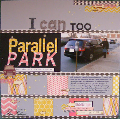
For this page, I decided mist would be the perfect way to soften all those horizontal lines and boxes purposely placed to reinforce my 'parallel parking' theme.

On last week's Project Life page, I decided the page was too busy for mist.  How did I decide?  The video shows my new trick of using mist splattered transparency film.

One caution:  liquids on transparency can take a long time to dry so be careful you don't tip the transparency over on your project or lay something on top of the transparency before it is dry.  

Watch at YouTube


Now for today's page, I think the journaling explains it best:


My husband is a wonderful parallel parker.  I, on the other hand, am not.  Actually, I’m not a good parker at all.  In my perfect world, all spaces would be wide pull throughs.  Reverse would rarely be used.  So when driving in a downtown area, I’m typically on the lookout for parking garage unless I get really lucky and there are many free streets spaces all in a row like this December evening in Asheville.  That is when I, too, can parallel park.


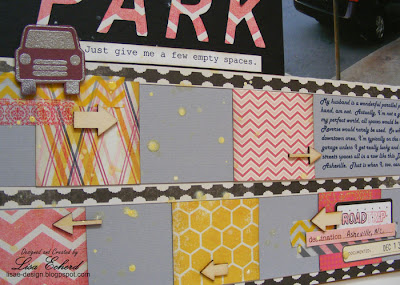
I used several of the papers from Artfuldelight's October kit which are from the My Mind's Eye Sweetest Thing collection.  I also built my embellishment areas from stickers and a Fisker's stamp creating a little van embossed in silver on Bravo Burgundy cardstock.  It is exactly the color of my van when it is clean - which right now, it definitely isn't.  


To help me out, Lenny has installed a backup camera!  I'm so excited.   When I bought my van in 2012, a backup camera wasn't available from Honda unless you upgraded two models and paid extra.  Now I think they are standard in all models.  I'm very pleased as this is a much needed safety feature on all vehicles.

Ooh, I almost forgot.  This page is also for Two Peas '8 things' challenge to use 8 different elements on your page.  My 8 are:  cardstock, pattern paper, wood veneer, a stamp, stickers, mini brads, washi tape and thickers.

Thanks for watching today!  My project life page is in progress and I'll have it up tomorrow or Thursday.

Monday, January 14, 2013

Scraplifting challenge


A single 5x7 photo without journaling is a challenge for me.  I'm always seeing these beautiful pages with a single photo, title and little or no journaling. They are so creative and I often crave the space on my page to use some of those ideas.  Yet, when I get a chance to do a title page like this, I'm a little intimidated by all that space.

So I chose this photo for the CHA scraplifting challenge at Two Peas.  We were to choose two sources of inspiration. These are the two layouts I picked - by Gutspiel  and by Lintsi.

I liked the simplicity of the first and the elements in the upper left and lower right corners . The second one had this little birdcage and I remembered having a birdcage, too.  It came it a kit and hadn't been used. I didn't have the tiny white flowers so I made some with ribbon and pearls.  This led to the other pearl accents.  I got to use some pretty ribbons, too.  I think it has been 5 or 6 layouts since I've used ribbon so I was practically on a fabric withdrawal.  Love ribbon on layouts.


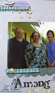
The photo is of my husband and me with our friends Karen and Jimmy when we visited them last spring. It will lead off other pages made about the trip.

Now I can't put an embellishment on a page without it meaning something so what does that birdcage have to do with the trip?  This may be a stretch but the trip was a chance to get away from home for a few days.  I'd been frustrated with sciatica pain and particularly my inability to drive myself very far at all.  So my husband offered to chauffeur me on this planned 'girls' weekend.  It was Easter so it was a chance for us both to get out and go somewhere and have some fun.  I felt very free and it certainly lifted my spirits.

Tomorrow, I have a tip on misting - To Mist or Not to Mist and another challenge layout.

Later in the week, I'll have a very versatile Project Life sketch using one week of photos on one page.  As always these sketches are good if you have a lot of photos from any event you want to scrap.

Thanks for stopping by!

Sunday, January 13, 2013

3 Trends card


One of the CHA inspired challenges at Two Peas this weekend is to create a project with three of the hot trends right now.  For my card, I created my own vellum (very hot trend) bag to hold confetti.  I've seen these little bags featured in a lot of Two Peas videos.  My confetti is just shapes I punched from scrap cardstock.

I also picked speech bubbles and enamel dots from My Mind's Eye.  What I'm noticing in the new lines being showcased this weekend are more feathers, high contrast bold patterns, bright colors, black replacing brown as a neutral, and journaling cards.  So far I haven't found a must have product or line, but then I haven't seen  Studio Calico, October Afternoon or Basic Grey which are always favorites.

There are lots of challenges.  Click here to get a list and further links.

Hope you are having a great weekend!

Friday, January 11, 2013

Coloring with Prima pencils and CHA


I CASEd this card from Jennifer McGuire's blog and the card shown here.  She did a video with it using Inktense pencils and a very pretty Hero Arts background stamp.   I didn't have either but loved the card.

So I substituted some individual flower stamps I have from Autumn Leaves.  It took a bit more stamping but was totally worth it.  My Prima regular pencils are probably 15 years old and were such fun to color with.  I always think that when I use them and then they go back on the shelf.  Got to remember to get them out more often.


Speaking of new Hero Arts, this weekend begins CHA - Craft and Hobby Association's - semi-annual show.  All the scrapbook and stamp companies will be showing off their new lines.  Many already have giveaway's on their blogs.  Here are a couple I've found:

Bella Blvd
Crate Paper
Pink Paislee

Twopeasinabucket.com has an event going on this weekend also with prizes and I think some challenges, too.

The winter CHA is my favorite as I typically love the spring paper lines best.   I truly do not need anymore paper right now but then what does 'need' really have to do with it? :-)

Hope you have a fun, crafty weekend!

Wednesday, January 9, 2013

Project Life, Project 365 Week 1 page and video


The thing I noticed while taking photos the first week of 2013  is how we seem to have the same resolutions as last year or the year before.  My husband is going to lose weight. I'm finally going to get my paperwork in order and keep it that way.  A little hint:  Do not go through bank statements on New Year's Day. If something isn't right, you can not call anyone and you end up with a sleepless first night of the year.  Fortunately, everything was fine the next day.

So, I took this idea to my page and captured what was new and what was not - or what was a bit of both.  Lenny had a new story to share from a vacation many years ago.  He always says I've heard all his adventures but I hadn't.  I have new/old clothes from the consignment store and so forth.

It was a pretty low key week and the photos definitely could hold up to some cropping.  Do we really need a 4x6 of the scales to know what they have to do with the new year?

This week's layout crops photos and pairs them with journaling and room for a fairly long title if you wish.  I created an embellishment area to the right of my photos with the year in stickers and some color to boost the page a bit.


The video will share tips on:
  • cropping photos
  • creating stamped embellishments that are similar but give some variety
  • and what to do with a long title that doesn't quite fit.

Watch at YouTube

The PDF contains the sketch and some ideas on printing journaling on your background on either a  large format or a standard printer.  You can of course handwrite your journaling.

Here is the file ---  Sketch for 1-9-13 and Tips

If you aren't doing Project Life or are using a traditional PL album, this sketch works well for any subject that has a lot of photos.

Thanks for watching!   

Tuesday, January 8, 2013

A little love and Project 365 Update


Happy Tuesday!  Typically on Tuesdays I have a tip or a video or both.  I'm working on my first Project 365/Life layout for 2013.  I'm running my week Monday to Sunday so I just got started on it this Monday and it isn't quite done, filmed and ready to upload yet.  I hope to have it Wednesday or Thursday.  In the meantime, I have this Valentine for you...

For my upcoming card class, we are doing this love card using a retired wheel from Stampin' Up and some distress inks.  We will first sponge a piece of white cardstock with pastel colors of distress inks and some Baja Breeze.  The design will be stamped using Colorbox fluid chalk in Chesnut Roan.

It is funny to me that the fluid chalk inks instantly dry yet the color changes over a half hour or so. The color softens a bit.  It is just odd to me how the color could change and it be dry at the same time.  Anyway, it is pretty color when set.

A little marker ink on the wood heart, a background stamp for the card base and some Baja Breeze pleated ribbon and the card is complete.

Thanks for visiting today!

Monday, January 7, 2013

On a New Path


This should probably say "A New, Old Path."  Last year when I started having sciatica problems, I had to switch from our town's park trail, which I love but is a natural, hilly surface, to our local elementary school paved trail.  The school trail is level and close to home.  An even bigger plus is that my husband started going with me.  His work is picking up and he has less and less free time. We took a little walk together yesterday, in fact.  And I was back at the park some late last year, thankfully.

Now onto the design...

Last week, Sue at suealthouse.com posted a great layout on her blog using several visual triangles.  See the layout here.   Often I do triangles, too.  Lately though I've been doing a lot of corner to corner embellishments to draw the eye across the page.

This page came together very quickly. I'm definitely not a speedy scrapper so when I can complete a page in one sitting it's rare.  Things that made this page go fast:


  • Using product all from one line - in this case it was Simple Stories' Harvest Lane. Even the die cut flowers are from 'b' sides from these papers.
  • Handwritten journaling - another rarity for me.
  • One type of 'Thickers' for the title - these are Basic Grey chipboard
  • Washi tape for embellishment.  I can't think of anything faster than tearing off a few strips of Washi to finish a page.
So most of my pages won't go this fast but it was rewarding to finish a page up quickly and move onto the next one which took me all weekend, but we really won't get into that right now. :-) 

Hope you have a wonderful Monday!  Thanks for stopping by,.

Friday, January 4, 2013

Masked Hearts Valentine Card


I have an extra video this week for this Valentine's Day card.  There isn't much time between Christmas and our next card making holiday.

For this card, I used my heart punch to create a mask and then some distress inks, masks and mists for the hearts.  The same technique could be used with lots of punches.


Watch at YouTube


I love the Naturals Ivory and White Cardstocks from Stampin' Up! for misting.  They really hold up well.   Thanks for watching!

Materials used:  Cardstock:  Chocolate Chip, Naturals Ivory and Real red from Stampin' Up!
Designer Paper from Stampin' Up! and Creative Memories
Mists:  Overdue and Cameo by Studio Calico
Masks: Intertwined Circles and Bubbles by Studio Calico 
Twine:  Doodlebug

Wednesday, January 2, 2013

Out with the old, in with the old

I may be the only person left on the planet who still uses a Palm Pilot - or did until this week.  My husband bought it for Christmas 10 years ago when I had a sales job and needed a way to keep track of my contacts.  This was when my cell phone weighed more than the Palm Pilot and didn't do anything but voice.

And with all the advances in technology, I'm actually going back to the little pocket calendar.  I did customize the cover.

Since I'm closing my business, I really don't need to keep a lot of information at my fingertips. Also I've found since I frequently take my parents and my aunt to doctor's appointments, I need to be able to jot down the next appointment fast and not have to click my way through menus to enter it into an electronic device.  Sometimes the old way is just the simplest.

So my little faithful Palm Pilot goes in the drawer.  That space in my purse is now occupied by my camera so I can capture my photo a day for Project 365.

Actually I'm already liking the ability to see the entire month of January at once or not have to wake up my computer to see where I'm supposed to be.  Normally, I love technology but there are a few things that are better for me the old fashioned way.

Thanks for stopping by today!

Tuesday, January 1, 2013

Year in Review Page, Sketch and Video


Happy New Year!!!
I'm so excited to be starting 2013!  I've made a big decision in my life and am so happy and at peace with it.  I've decided to close my window treatment business.  It has been nearly 16 years.  Many of those years were part-time yet it was consistent and something that I really used to identify myself and other people identified with me.  There are many things I love about the work yet gradually I enjoyed the work less and less.  It is just time for a change.

Now what kind of change?  I'm not sure yet.  I'll be spending some time figuring that out which is both scary and incredibly exciting!

So for New Year's Resolutions and Goals, my big one is to figure out what kind of work I want to do next and make that happen.

My resolution is to do Project Life/365.  My way of doing this is to take a photo every day and scrapbook them in a traditional way.  I'd like to do more journaling with the the photos this time through.  Every photo doesn't need something lengthy just a bit more than I did in 2010 - the other time I did Project 365.  I decided to do this again because I haven't been taking as many day to day photos.

I plan to share the process here on the blog with layouts, sketches and videos which brings me to my commitment for the blog this year:  To create and post one sketch and accompanying video each week.  I'm thinking it will be about 75%/25% scrapbooking versus cardmaking videos.  My goal is to keep them at 10 minutes or less.   However... I've already blown that part of the plan with today's video at about 13 minutes.  This page has quite a bit going on.

The main focus are the pockets:


Each year I do a wrap up page to look at what I accomplished in the previous year and what I have planned for the new year.  This is a holdover from my corporate days where we had to write out objectives each quarter and then summarize our accomplishments.  I'm not that formal but I still do write out goals for the year and like to review the previous year to see how things have gone.

This info is personal so I don't want it to be seen if someone is flipping through my album.  This year I did sewn pockets to hold an extensive amount of journaling.


The page also has a reverse print title created using stickers and mist.


A few days ago I said I couldn't even put a butterfly on a page unless it meant something. Butterflies are a symbol of life and change so they have meaning here.  Plus they are pretty :-) and a very easy embellishment to create.

So here is the video you can watch at YouTube or click here.

This PDF file contains the sketch and some tips on creating pockets.

Thanks for starting off the New Year here on the blog.  Have you made resolutions?

Happy New Year!
Related Posts Plugin for WordPress, Blogger...