Pages

Wednesday, September 30, 2009

Lovely Letters Monogram


Lovely Letters stamp set creates gorgeous monograms, doesn’t it? To create these inverse color images:
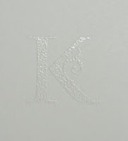
1. Stamp first in Versamark and emboss with white embossing powder.


2. Then sponge on Rose Red craft ink.
3. Lightly rub excess ink off the white image.

You can sponge the color lightly or add more and more color for fuller coverage.

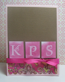
Ingredients: Stamps: SU Lovely Letters
Paper: DSP by My Mind’s Eye and Soft Suede DSP by SU
Ink: Versamark and SU White embossing powder
Ribbon: from AC Moore

Tuesday, September 29, 2009

TIPsy Tuesday - Masking

In the last two posts, I’ve shared cards I made from watercolored images. Before watercoloring, I stamped the flowers using a masking technique. Masking allows you to create stamped images that look layered. One flower is underneath another flower in a natural position. You can use masking with any two stamped images that need that layered affect to look more realistic.

Here is a great video from Carissa Wiley on YouTube to show you masking techniques: http://www.youtube.com/watch?v=YgVyHS0rCVo

And here are the brief instructions for a quick reference:

To create your mask:
1. Stamp the image that needs to be "on top" on scrap paper or a Post-it note.
2. Cut out very close to the edges.

To use your mask:
1. Stamp the image that will appear “on top” first. (I know this seems backwards!)
2. Cover the image you just stamped with its mask. If you stamped on a post-it you may have a little built in adhesive to help the mask stick. You can also use some removable adhesive or just hold the mask carefully in place with your fingers.
3. Stamp your “underneath” image. Part of this image will be on your mask and part on your finished product.
4. Remove the mask. Store with your stamp set to use again.

You can build layer after layer, just remember to start from the uppermost layer and work your way down.

Hint: When I am making masks or doing some other type of scrap work, I use a discontinued ink color or one I don’t like that well saving my current stuff and favs for other projects.

Ingredients: Stamps: Stampin’ Up!’s Fifth Avenue Floral, Kindred Spirits and On Your Birthday for greetings
Ink: Basic Black, Close to Cocoa, Soft Subtles and Rich Regals Watercolor crayons, Earth Elements Markers
Ribbon: SU’s So Saffron Grosgrain, Pink check from local stamp store
DSP: My Mind’s Eye

Monday, September 28, 2009

Lavendar and Black


This weekend I had a chance to pull together cards for the watercolor images I did at the hospital earlier in the week. I think this is my favorite.
When I originally stamped the images mostly on scraps of watercolor paper, I did a couple of them too close together on this one strip of paper. So I had to tear it diagonally to preserve both images. One of those created an interesting place to stamp the greeting in Versamark and then emboss in white embossing powder.


I love to put purples and black (or grays) together in my wardrobe and in cards. It isn't seasonal and has a bit of extra class.

Tomorrow we'll see the last of these cards and hopefully a link to a great video on masking. I just have to chase it down on YouTube.
Ingredients: Stamps: Stampin' Up! 5th Avenue Floral, Upsy Daisy for Greeting
Ink: SU Watercolor, Earth Elements Markers, Versamark
SU White embossing powder and Black gingham ribbon
Lavendar ribbon from fabric store
DSP from Colorbok
other papers are from unknown sources.

Friday, September 25, 2009

Watercolor while waiting

My upline Jean once mentioned how you could get some cardmaking done while waiting in the doctor's office or any of a number of places where you are a captive audience. Stamp a design ahead of time. Then take along coloring pencils and a blender pen.

My Dad had surgery earlier in the week (and is doing fine). Before going to the hospital, I stamped out a few flowers from the Fifth Avenue Floral stamp set on water color paper. I packed those, two tins of SU watercolor crayons, some scrap paper, and a couple of blender pens in a plastic paper storage envelope and tucked it all in my tote bag. Coloring in the flowers was a great way to make productive a little of the many hours we spent waiting. (BTW, the only good thing about being the last family still left in the waiting room at the end of the day is you get control of the TV.)
I finished the card above at home today. Next TIPsy Tuesday I'll share more of these designs and how to do the masking that allowed some flowers to be 'on top' of others.


Ingredients: Stamp Sets: Fifth Avenue Floral, Kind and Caring Thoughts for greeting.
Watercolor crayons: Stampin' Up! Soft Subtles and Rich Regals
Paper and ribbon are from unknown sources.

Thursday, September 24, 2009

Very Free-form Quilting

My mother asked me earlier this week what personal sewing project I was working on. I had to be evasive because my current project is for her and my dad. I just finished the machine quilting on a quilt for their bedroom I plan to give them for their anniversary in a couple of weeks.

Last winter Mother borrowed a quilt I had made for us that was large enough for queen size bed. She has many family quilts made by my grandmothers. Unfortunately, old quilts come up short when it comes to larger beds. I told her I would make her one and hopefully she forgot. I want this one to be a surprise.

Here is a little sample of the free-form quilting. I consider this a utility quilt so I've taken the liberty of doing some experimenting. This leopard print fabric is the striping in the quilt and I am quilting randomly around the little spots. With free-form quilting, the sewer, not the machine, controls the speed and stitch length by moving the fabric freely under the presser foot. It takes practice - apparently lots of practice.

Wednesday, September 23, 2009

TIPsy Tuesday - Selecting Christmas Stamps

(This should probably say Tipsy Wednesday although I wrote it on Sunday. Crazy week!)


There are so many beautiful Christmas stamps in the 2009'-10 Stampin' Up! catalog that it can be hard to choose. One year I made my Christmas cards all the same and I got a little tired of doing the same design over and over. So the next year, I made many different designs with several different stamp sets. That ended up being a little much - at least for the time I had available.
The big question in selecing Christmas stamps is how many sets and what sets do you want? For me the question - no matter the season - is how much use am I going to get out of this set?

This year I ordered Season of Grace to do my Mother's Christmas cards. This set has three image stamps and two message stamps. At first I thought it might be limiting but I've realized from the SU catalogs, Splitcoaststampers gallery and my own experiementing that there are many different cards I can do with that set. I plan to use it next year for my cards and I've already used it for a Stamp-a-stack.
I ordered Home for Christmas for my cards and also used it at Stamp-a-Stack. (Click on the "Classes" catagory to see these two sets used.) But I needed more cards for Stamp-a-Stack and found several options:
  • Serene Snowflakes shown in the last two posts of course makes really pretty holiday cards. And it doubles as just a beautiful intricate design for background or featured images on many cards and scrapbook pages. I'm sure I'll have this one out all year.


  • Season of Friendship is designed for the 4 seasons. What better way to celebrate the holidays (if you live in a cold December climate) than the card above with white snowflakes and sponged and embossed white ink for snow. Cardinal's are the NC state bird and a frequent visitor to our winter bird feeder.


  • Finally, I pulled out 'old faithful' that little truck set called Loads of Love. Here is the card we made.

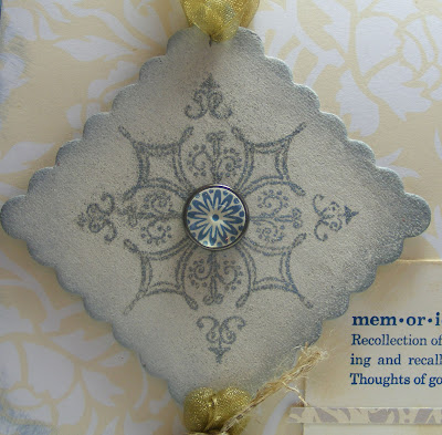
So I have many options for Christmas this year and I bet you do too. When picking a stamp set, consider the cards you can make for yourself or to give to friends or family to give. A beautiful set of handmade Christmas cards makes a wonderful early Christmas present. Go through the sets you already have. Anything wintery you could use for the holidays? Or what about using the new ornament punch from the mini catalog with designer paper and some ribbon for a non-stamped card.


Also, you might consider doing a swap at some point with other stamperss so everyone gets a fresh holiday set to use.

Sunday, September 20, 2009

And it can be a Snowflake, too!


Here is Serene Snowflakes again in a more traditonal use. We made this card at our Stamp-a-Stack yesterday. The snowflakes are embossed in white BEFORE stamping the smaller snowflakes in Versamark for a background. (I learned the hard way that it takes a little longer for Versamark to dry than I thought :-)

Ingredients: Stamps: Serene Snowflakes, All Holidays (greeting)
Paper: Going Gray, Basic Black
Ink: Versamark
Ribbon: White 1/4" grosgrain from Stampin Up!

Friday, September 18, 2009

More than just a Snowflake

Serene Snowflakes will probably show up on some of my Christmas cards. I'll post a holiday card using this set next week that we are making in our Stamp-a-Stack this Saturday. However, I bought this set because of the detail and versatility of the images. It would make beautiful background stamping for a scrapook page.


This card features the largest of the snowflakes stamped in Versamark and embossed with some Ranger powder I had. I could have probably stamped in Bordering Blue Craft and embossed in white for a similar affect. Before stamping, I sponged the chipboard with Very Vanilla craft and then Ranger's Weather Wood on the edges.

The center is my first build-a-brad. I love it! These are the pewter ones; the antique brass will be on an order very soon.

Ingredients not listed above: Stamp Set: Serene Snowflakes, Define Your Life and One of a Kind (center of the brad) by Stampin' Up! Also Flourishes by Paper Studio.
Cardstock: Dark Heritage Gray by Worldwin Papers
Not Quite Navy and Very Vanilla by Stampin' Up!
DSP is Bella Bleu by Stampin' Up!
Embossing Powder: Weathered Wood by Ranger
Ink: Not Quite Navy by Stampin' Up!
Chipboard: Stampin' Up!
Ribbon: Hobby Lobby

Thursday, September 17, 2009

Wow! Digital Layouts

I came across this link on a message board and all I can say is Wow! These digital layouts are phenomenal.

Go to http://gallerystandouts.com/ to see some amazing work by very talented scrapbookers.

I've done a few completely digital layouts. Personally I prefer a hybrid or digi fusion approach. I do some of my layout on the computer - collages of photos and/or titles and journaling printed on my background paper. Then I usually put it all together with tangible embellishments. I like the actual feel of the layers on a page and enjoy the process of paper crafting.

Stampin' Up! is debuting new digital scrapbooking software and downloadable elements next month. Since I already have software for creating digital pages, I won't be purchasing the software but I know I'll be taking a look at their images to see what I want to incorporate into my scrapbooks.

Tuesday, September 15, 2009

TIPsy Tuesday - Little Scrapbooking Tips

While putting together this 2 page spread, I was reminded of a few little things that help me:
  1. I cut and laid out everything before I started so I would know how far up or down the page to start the photos. This also helps conserve paper. There is only one piece of 12x12 Not Quite Navy cardstock for the layout.

  2. Since I wanted the numerous paper layers to appear to continue across the spread, I started at the top of each page. I adhered the Not Quite Navy cardstock on each page, then the scalloped DSP (this is a handcut scallop following the design of the paper), and so on down each page side by side.

  3. To get the most out of my pattern paper, I cut the middle out of the paper I used to mat the photos. One of those pieces is flipped over and mats the half circle photo.

  4. My gridded ruler is my favorite tool for just about every layout and a lot of cards. I purchased this well used one from Cottage Mills in the fabric department of a craft store. It is 2" x 18" with 1/8" full lines:

  5. Rummage the momentos left from travel or an event. The '50' was cut from a scrap left over from the invitations I did last year for this event. The gold ribbon was leftover from wrapping the napkins for the tables.
  6. It is hard to get all these little paper strips to stick sometimes so after I finish a layout, I go back over it with a toothpick and a little white glue to touch up anything that is not affixed.

Finally, step back and perhaps even walk away for awhile. I thought this was coming off too busy but after I came back from a break and took a fresh look, I liked it much better.

Ingredients: Stampin' Up! DSP Bella Bleu

Cardstock: Not Quite Navy, Kraft and some vanilla that I'm not sure where it is from. Vellum from Hobby Lobby.

Ribbon: Gold from Morex, Very Vanilla from Stampin' Up!

Sunday, September 13, 2009

Bookmark - Between, Georgia


After a busy day yesterday and a restless night, this morning was a good time to be lazy. So I curled back up in bed with the last few chapters of "Between, Georgia" from Joshlin Jackson. Jackson's characters are authentic Southern. Actually I think they could probably be found in a lot of places. Her heroine, Nonny, has two families - the mother who raised her is deaf, blind and completely endearing. Both families are bent on feuding in ways from committing slights to felonies. She's caught between families, lovers, and homes.

This is the second of her books I've read. The other is "gods in Alabama." I consider these somewhere between chick lit and serious literature. In other words, they make you think but don't make you think "what was that I just read again?"

I made the bookmark last week when I was experimenting with Christmas cards for my stamp-a-stack this Saturday. This design was much too sunny for a winter card and I needed a new bookmark anyway.
Ingredients: All from Stampin' Up! Stamp Set: Kind and Caring Thoughts
Ink: Old Olive, Ruby Red
DSP: Ruby Red from Patterns III pack - a hostess set in the current catalog.

Thursday, September 10, 2009

Designer Paper 6" Packs


The Apricot Appeal background paper on this card and the Brocade Blue stripe are from a 6" paper pack that was one of the hostess gifts a catalog or two ago. I first selected one of these packs as an alternative to the stamp sets being offered. I have since collected 3 different ones and I use them all the time. I love the visual dimension tone-on-tone papers give to a card or scrapbook page. When I get one of these packs, I write the Stampin' Up! color names on the back for easy reference.
.
Happy Birthday this week to my upline, Jean!
.
Ingredients: All by Stampin' Up! Stamp Set: Fifth Avenue Floral, On Your Birthday
Cardstock: Apricot Appeal, Whisper White
Ink: Basic Black, Really Rust, More Mustard and Brocade Blue
Watercolor crayons
Brocade Blue 5/8" grosgrain Ribbon

Monday, September 7, 2009

TIPsy Tuesday - Couples Photos

We love to go hiking. While we don't trek off into the wilderness, we do often end up alone on trails in lovely photogenic spots. Sometimes we use the self-portrait feature of the camera. This requires either a good spot to rest the camera or a tri-pod. (And I lost our portable tripod after taking it all the way to Hawaii and the never actually using it. I've never seen it since our trip.)

There was the time we hiked to the top of this "hill" (actually a mountain where I come from) in the Canadian Rockies and asked a French Canadian passing by to take our photo. I didn't learn the words he actually used in response in my high school French class, but he did take our photo. In his defense, it was sleeting - in July! Who really wants to stand around wet and freezing taking some stranger's picture?

So we typically end up with Lenny taking a photo of me and I taking one of him. Do you ever get your photos back from a trip or event and find a lot of singles and realize you didn't take that perfect shot of the two - or more - of you together?

One solution is to combine the photos on a page by placing each photo in a frame and linking them.


Here is another one I did for an earlier book. The chipboard here is the leftovers from a couple of tags:


Ingredients for Kauai: Digital Overlay: Anna Aspnes

Ink: River Rock by Stampin' Up! (used to touch up the edges because I didn't print it all the way to the edge), and Cameo Coral

Chipboard frames by Stampin' Up!, Letter K is Wilma by Basic Grey

Ingredients for Let Nature Nurture: Chipboard letters by Basic Grey

Posted stamp from Office Accruement by Stampin' Up!

Casey's Collage

I dreaded making these pages.
It has been over a year that our Casey Cat has been gone. She was with us for over 10 years of her life. It was amazing the presence a little 8 lb cat could have. I'll always miss her.

Making the pages wasn't as painful as I expected. The photos are all ones taken in the last few months. The very last one made of her is in the "e" of her name. She had gotten 'caught' upstairs when Jaime's family was here. She came in early that morning and upstairs with me. Then the kids got up before she could make her escape. I photographed her standing at the top of the stairs trying to figure out how to get out without the children clambering to pet her. She loved to be petted; she just wanted it on her terms.


There are dozens more pictures, many had already been in other scrapbooks. In fact, she was a tiny figure supervising Lenny's worktable building in the photo on yesterday's post - a scrapbook page from 2006.


To use this variety of photos, I resized, cropped and printed them. I didn't get too carried away figuring out the exact size I would finish with. Then I cut some down leaving a little white showing for mats. I used other neutral papers from my scraps bin for matting the others. Dimensionals help some photos stand out.

The collage effect helps show how big a part of our daily lives she was.
Ingredients: Designer Paper from Design Originals
Ink: Stampin' Up! Soft Suede, Chocolate Chip
Stamp: Inkadinkado's Catattitude
Ribbon, chipboard and metals are unknown sources

Sunday, September 6, 2009

Is it worth it?


It seemed like I spent a great deal of time the last couple of days going through photos, printing contact sheets and figuring out what papers I had to scrapbook what stuff in the coming months. This was part of a strategy to get my scrapbooking projects organized so I could work on pages when I had a few minutes, an hour or just had the photo printer turned on for some reason and wanted to print some things. It is far less daunting to do a little at a time than to decide I need to get 20 pages done in the next month! The classic tortoise versus the hare.


Last night in my journal I wrote something about all the energy I expended on this task. Was it worth it? Is it worth all the time and money I put into scrapbooking? Sure I enjoy it. So I reached for the nearest scrapbook album, the last one I completed for the 2006/07 years and flipped through, reading a little journaling here and there, critiqing a page or two, reliving a memory. I just reached the end when my husband came in for a long day of pinball repair and I greeted him with a smile. I was happy to see him of course, but I was still thinking about how much fun we had together in life. I'd been reminded of every day stuff, travels, family and friends. I was proud of what I'd created in that book and what we create in life together.
And now, my husband is going through the same album, making comments, remembering and he has a sweet smile on his face as he closed the cover.

Yes, it's definitely worth it!


(The page above is from that 2006/07 album. Ingredients that I can remember are: Stampin' Up! Office Accruement Stamp Set
Ink: Really Rust, Brocade Blue
Striped Paper: American Crafts)

Friday, September 4, 2009

No photo, please

One of the best things about card making is you have so little investment in an individual card. If you create something that falls way short of a masterpiece, you can salvage it or just scrap it. That is what I did last night.

I had this great design rolling around my head all day. It was based on one I'd seen on another blog and I was adding my own interpretation. Something was definitely lost in the translation from my brain to my work table because what I created just didn't look that great. So then I started really playing with it and all I got was ... experience.

Yet, this is part of the fun of this hobby. It is just one card, no big loss. I had fun playing, I learned stuff and the next card is sure to be a masterpiece - or not, but either way, it will be fun.

Thursday, September 3, 2009

White Daisies

Still working through my stash of paper and ribbons. It seems like years ago that I last bought one of those large paper packs from the craft store. They seem like such a good deal because it works out to pennies per sheet when they are on sale. And it is cost effective, IF I'd ever use all that paper before I got tired of it. The other drawback is that so many of those papers are thin. This one is a good quality and I've made pretty good use of the different designs.

The Upsy Daisy stamp looked so great embossed in white on Razzleberry Lemonade DSP a few days ago, I tried it on this DCWV paper from my stash. The daisy flower in front is a paper flower that I touched up with a little Whisper White ink. One issue with paper flowers is they tear easily when attaching small glue dots. I had to use the large popup dots from glue dots to adhere this to the card.
The scalloped cardstock on the side and the greeting are stamped in Purely Pomegranite, an In Color from a couple of years back.
Ingredients: Stamp Set: Upsy Daisy from Stampin' Up!
cardstock, ribbon and button from unknown sources
Paper flower from a Sam's Club scrapbook kit
Paper: DWCV

Wednesday, September 2, 2009


The 2009-'10 Stampin' Up! Idea Book and Catalog has some great projects for stamp sets I have and have on my wish list. The set featured here is "One of a Kind." It coordinates with the Boho Blossoms punch. I CASED this card by changing the colors and papers to coordinate with some ribbon I had in my stash from a couple of years back. Ribbon is another place to get color inspiration. Otherwise I would have never considered using Melon Mambo and orange together. Yet, they really work.


I did mess up a couple of cards in stamping the "for you" greeting so I did a 'thank you' instead on some rectangular chipboard pieces I had. First I brushed the chipboard with a Bordering Blue craft Stampin' Spot. Then I stamped the greeting in Melon Mambo.


Ingredients: Stamp Set: One of a Kind
Ribbon: Paper Studio
Button and cardstock: sources unknown

Tuesday, September 1, 2009

TIPsy Tuesday - Stamped Flowers

Here is a close-up from the scrapbook page I posted over the weekend. Not only does this embellishment dress up the page, but it does a bit of camoflauge.


The photo was printed for a board full of photos for my husband's birthday party in June. Unfortunately, in removing and storing some of the photos I wanted to scrapbook I wasn't careful enough and some adhesive from another one stuck to this one and well, you can see, it got ripped. Rather than reprint, I decided to cover it up.

I started with a couple of plain flowers. The large cream one is from a silk flower I bought at Hobby Lobby and pulled apart. Some silk flowers work really great for this. You just have to examine them carefully to see if you think they will work well after being removed from their stem. Stampin' Up! also sells white daisy flowers in their Pretties Kit. That is on my wish list as I haven't been able to find silk flowers that color and size. Plus the kit has lots of other pretty things as well.

The other flower is a paper one that was part of a scrapbooking kit I got for Christmas from Sam's Club a couple of years back.

To stamp flowers:

  1. Choose a good all over stamp. This one is actually one of the 'trees' in Trendy Trees!


  2. Begin in the center and go in circles working your way out to the tips of the petals.

To ink the paper flower:


  1. Use a sponge dauber and add a little color to the petals. I experiemented on the back side of the flower to find the best color. I started with Bordering Blue but it was too gray so I switched to Brocade Blue.

Layer your flowers as desired. I used a button center for this one. A Circle Ice or Circle Fire grommet works great, too!

Related Posts Plugin for WordPress, Blogger...