Pages

Monday, October 31, 2011

Finished!


I can't believe it!  My Mother's mini album for Christmas is done!  I had it just under half finished when I started back on this weekend and just kept clicking along until it was done.  Since I'm not that into mini albums or heritage albums, I had dreaded this project.  It moved along nicely though mainly I think because I stuck to the supplies I had out for the most part.  I love to rummage through my papers and embellishments for the perfect thing for my pages.  This time I kept to the paper kit, some ribbon, buttons and 1 6x6 pad I'd saved for the project.

Here are the pages I haven't shown in previous posts:

My Grandparents and the home where Mother grew up.


Mother as a little girl and with her sisters
Teens and 20's
70's and 80's


This back page is the only one I'm not happy with.  I like the photos.  My embellishments are sort of all over the place and just don't pull it together, but I've got everything glued down now.  I wanted to use more photos of my mother and father together so I did the collage.  These are mostly while traveling from the mid-70's through the 80's.  And I realized I'd never put mother's name anywhere in the album so this was a chance to use her full name.

The only drawback to having this done is I have to keep it secret until Christmas.  If I even as much as hint about anything, she will pester me to death until she founds out what I've made. It has been awhile since I made a gift for her and I know I, too, will want to share it early.  I'll just have to bury it in one my upstairs dresser drawers and forget about it.  (mentioning the location here so I really don't forget where I've hidden it :-)

Thanks for visiting today!

Ingredients:  Crate Paper Prudence collection, Paris and Co. My Mind's Eye 6x6 paper pad
Ribbon:  Webster's Pages
Buttons and brass embellishments:  Tim Holtz
Rhinestones:  Prima (cover) and Kaiser (clear ones)
Cardstock:  Ocean Tides by PTI

Thursday, October 27, 2011

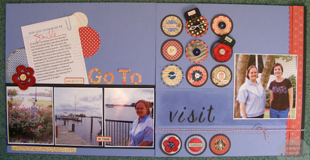
Stretch the Sketch - Go to Visit layout


This month's Stretch the Sketch challenge at Two Peas uses a two page sketch.  I kept to the sketch with the size and arrangement of photos.   I changed what were little tags to circles and inserted part of my title between them.  Just as instructor Jen Gallacher did I added some more to the first page.  In my case, it is where the journaling is placed.  To balance the layout, I added some strips of vertical paper on the far right.


This is the rest of my visit to my friend Karen's house a few weeks ago.  Some of the circle embellishments have special meaning.  I crocheted the flowers because we talked about crocheting and Karen showed me some of her lovely projects.  We visited an antique store so I used some antique looking papers.  There is a place setting icon to remind me of the great food at their house.  Also I use maps and map themed letter stickers to remind me of traveling around the city.  I wish I could be more random with my embellishments but I tend to want to tie them to the subject matter some how.

My favorite is the quote under the photo of roses.  It is off some October Afternoon paper and just happened to be the main quote in a tiny strip of paper I had left.  "God gave us memories that we might have roses in December."

I have wonderful memories of my visit.  I'm grateful for the scrapbooking hobby and all the things I learn from my fellow bloggers that help preserve those memories.

Have a great weekend!

Ingredients:  Cardstock:  Brocade Blue by Stampin' Up!
Stamp:  Ledger by Hero Arts
Ink:  Basic Grey by SU!
Build-a-brad:  Pewter by SU!
Stick pins by Tim Holtz

Wednesday, October 26, 2011

Wise Men


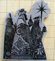
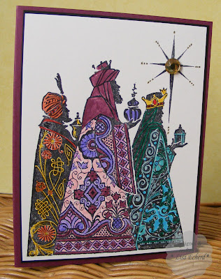
Did I need this Wise Men stamp from Stampendous I spotted at Archivers a few weeks ago?  No.  I have two other wise men stamps already.

Could I resist the intricate design and keep it out of my shopping basket?  Well, apparently, No to that too!

I'm so glad I didn't resist.  I loved coloring in this image with a big assortment of Stampin' Up! markers.  It is time consuming but so far my favorite Christmas stamp.  I'll probably do my Mother's cards out of this one.  Have you picked a holiday stamp yet?

Thanks for visiting today!

Ingredients:  Stamp:  Cling Wisemen by Stampendous
Cardstock:  Wisteria Wonder and Rich Razzleberry by SU!
Gems:  Hobby Lobby jewelry dept.

Tuesday, October 25, 2011

Tone-on-Tone options for B-siders

Do you find yourself using a lot of the 'B' sides of pattern paper - those little polka dots, stripes or other small designs that are often just a darker shade over a lighter background in the same color?  If so, you probably like the tone-on-tone look and you can easily get this with cardstock and stamps - ones you probably already have.

If you are new to stamping or an occasional stamper, the one type of ink I'd recommend you buy is Versamark or another brand of clear watermark ink.  This type of ink will give you more mileage out of your stamps than anything else you can purchase.  Take it one step further and get some clear embossing powder and a heat gun.  Versamark is the easiest and cheapest way to achieve tone-on-tone affects.

With a tone-on-tone look you can create your own pattern paper.  In this sample, I wanted to compare the depth of color I would get in three different ways of doing tone-on-tone.


On the far left is an image inked with Versamark and stamped on the cardstock.  That's it.  I did let it dry as Versamark is a sticky ink that takes a few minutes to dry.  This is the most subtle look.

The center is stamped with the same color ink on the cardstock.  In this case I used Brocade Blue ink on Brocade Blue cardstock from Stampin' Up! (My handwritten notes say Bordering blue but it is really Brocade.) This color has been discontinued but the idea works with any color or any brand of cardstock that sells a companion ink.  It is also the one that gives you the most variation from color to color.  Some colors really pop like this and some are more subtle like the first example. Experiment on the back of your layout as I'm doing here.

The last one on the far right is stamped with Versamark, sprinkled with clear embossing powder and heat set.  It gives a glossy finish and some texture in addition to the change in color.

I'm still deciding what I want to do with the layout I'm working on.  It is wonderful to have so many options with just a few products.

Thanks for visiting!

Monday, October 24, 2011

Journal Cover


Covering this journal was one of those projects where I had to really rethink myself.  I started out inspired by a video from Kristina at Two Peas.  She was using various torn pieces of paper and gluing them to a journal cover and then inking.  It was all a very distressed look. I knew I'd want to take some of the randomness out of it to fit my style.  So I started with all green and blue/green papers - my favorite colors and peaceful colors.  I did my tearing and sort of placing of the pieces before I glued anything - fortunately.   It just really wasn't me.

After stepping away from the project for awhile, I knew I could salvage some of the idea and get something that worked with my style but still stretched me a little.  I took some of the torn pieces and stamped them with leaves.  Then I placed them between strips of neutrals punched with border punches - a much more structured look.

The purpose of this journal is to dig into my thoughts and experiences and try to figure some things out. Yoga was recommended by one of my doctors to help me sleep better. I had a yoga therapy session recently and the therapist identified that I have a lot of fear.  I know this, I just don't know where it is coming from.  I have lots of theories but I can't fix or change everything at once.  I might change something that really isn't the problem and make things worse.  Anyway, I need to do some more journaling.


So the cover symbolizing peeling away the layers and hopefully getting some growth (leaves) and some peace (blues/greens).  I like to keep my artistic references clean, too. Ha!

Since I was afraid (there we go again!) that I'd screw up the cover, I glued all these pieces to cardstock.  Unfortunately all these layers got so thick I couldn't wrap the front of the cover to the back so I just had to trim it and glue it on.  It works.  The notebook is large so I can print out my computer journaling and add it to the pages and work in either medium as inspiration strikes.

As always with notebook covers, I'd love to add buttons and thicker embellishments. However, I don't because I want to fold the notebook back and really be able to write in it.  Don't want anything lumpy in my way.

So now it is just a matter of digging into the gray matter.  Paper is so much easier.
Thanks for taking in my rambling tale.

Ingredients:  Stamps:  Summer Leaves by Stampendous
Ribbon:  Stamper's Alley in Mooresville NC
Ink:  Bermuda Bay, Old Olive, Mellow Moss, Kiwi Kiss by SU!

Saturday, October 22, 2011

C is for Crochet


One of the challenges at Scrapbooker's Anonymous this month is to use the letter "C" to inspire.  I've used lots of Crate Paper Farmhouse collection, fabric covered Chipboard letters, a Crochet theme, and some actual Crocheted embellishment.


The layout uses this month's challenge layout at Artfuldelight.blogspot.com 


Journaling reads:


In the 6th grade, I saw my friend Cindy crocheting.  I wanted to learn and Mother got Nan Price to come over and give me a lesson.  Soon I was going to Nan’s house each week for lessons.  I made coat hanger covers, toboggans and soon graduated to full afghans.  My favorite pattern was the Park Avenue made in strips and then crocheted together.  This was one of the last I did for our house in 1993.  I took up quilting and eventually my hands protested the repetitive motion of crocheting.  I miss my favorite craft.  Time spent with patterns, yarn and needles will always be a wonderful memory.  I was definitely…
Hooked on Crochet


I was a crochet fiend for years making almost all my gifts for friends and family during high school and college.  I learned to knit, too but my stitches were never as even as crochet.


While I don't regularly crochet anymore, I have found that my hands will tolerate just a bit like the scalloped border here.  I keep a neutral color of crochet cotton and then use ink to dye the finished product to suit the page.  In this case, I dyed it in Riding Hood Red classic ink from Stampin' Up!

I really miss crocheting particularly now that it is so popular again and there are so many beautiful yarns.  It was a great hobby to do in front of the TV.  I've been coloring some stamped images instead.

Thanks for visiting!

Ingredients:  DSP:  Farmhouse by Crate Paper, Thrift Shop by October Afternoon
Stickers:  October Afternoon and Girl's Paperie
Chipboard:  Patchwork Thickers by American Crafts

Friday, October 21, 2011

OWH Mailbox Greetings Cards


Thank you for visiting me! I'm honored to be a Featured Friday Cardmaker on the Operation Write Home Stars and Stripes blog this week.  Thanks so much to Dixie - my shipper - and everyone there who do such a fantastic job to be sure our cards are sorted, packed and into the hands of our troops!

Today's cards use one of my favorite stamp sets for making OWH cards.  I bought this set from Papertrey Ink (www.papertreyink.com) because I loved the little mailboxes.  I use it all the time because of the greetings.  There are 18 greetings with the set for all kinds of occasions.  The small size makes them hard workers.

The card at the top is a general thinking of you card with an inside greeting of:  "Even though we are apart, I am thinking of you."


This card will soon go in a box to OWH as it is winter themed. To create the snow, I stamped a snow outline image from the set, filled it in with a Versamarker and covered in white embossing powerder.  I had to layer the embossing powder about three times to get enough coverage.  The snowflakes are from an Inkadinkado set and are also embossed.

I'm glad you stopped by today.  I do both cards and scrapbooking so you will see some of each on my  blog.  Since cards are faster, there are usually two or three card posts for every scrapbook layout.  I like to participate in challenges and also do my own thing.  Every Tuesday I share a tip, sometimes with a video.

Hope you will come back soon!

Ingredients:  Stamps:  Mailbox Greetings by Papertrey Ink (PTI)
DSP:  floral print from Crate Paper Farmhouse Collectiong, brown stripe is Soft Suede by Stampin' Up!
Markers:  Stampin' Up!
Cardstock:  Kraft by PTI; Crushed Curry, Soft Suede and Old Olive by SU!
Ribbon:  Soft Suede by SU!
Twine:  Enchanted Evening by PTI
Wednesday, October 19, 2011

More on Mother's Mini


I'm hopping around on Mother's mini and am almost half way there.  Above is the cover page using a Prima jewel I bought at Archivers.  That is just about all that brown lace from Webster's pages.  I hate to use it all up.  They have the most gorgeous trims!

The photo of my Mother was taken when she was 17.  I think it is her favorite photo.  The pages below will be near the back of the album.  The first page of Mother with me was shows photos from the 60's.  I went a little more modern with the paper on the later page for the 70's photos.  We will fill in the journaling block when I give her the album.  I can not place the location of the photo taken of the two of us on a green vinyl couch.  Who had a couch like that?  I just can't remember but I bet she will.  Perhaps it will touch off a memory of an event, too.


There are very few photos of my mother and me together when I was growing up - maybe a half dozen total.  It's sad really that no one took pictures.  I'm so glad today that people take so many pictures of their children.  I just hope these photos get preserved and don't stay forever in phones and cameras.  It is one of the best benefits of our scrapbooking hobby - scrapbookers take more photos.

Thanks for visiting!

Be sure to come back on Friday as I'm honored to be a Featured Friday Cardmaker on the Operation Write Home blog.  I'll have a couple of cards to share.

Ingredients:  Stamps:  Lovely Letters by stampin Up! embossed in copper
Prudence collection by Crate Paper; Paris 6x6 pad by My Mind's Eye
Trim:  Webster's Pages
Button:  Tim Holtz
Mini:  Bo Bunny

Tuesday, October 18, 2011

TIPsy Tuesday - Digi Stamps with Waterbased Markers


Digital stamps are downloadable images purchased typically one image at a time or sometimes in sets.  They offer flexibility in that you can alter the size of the image.  They are usually less expensive than traditional stamps.

There is one drawback that I had to overcome before I could use this latest way of stamping.  When I downloaded a free image and printed it on my Epson inkjet printer, the black printer ink would run when I colored in the image. (I tried heat setting and giving it some drying time but that didn't work.) I only have water based markers - specifically Stampin' Up!  Copic markers are very expensive and I just didn't feel I would do enough coloring to get into collecting them.  Still I wanted to have a larger selection of images I could color.

Here is the solution I found:

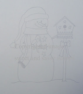
I purchased this image from Sweet and Sassy Stamps.  This technique should work with anyone's jpg image.

I then inserted the image into a blank Word Document.  In Word 2010, I clicked on the image once and chose Picture Tools, Format, Color and then the light gray image in Recolor.  This turned the black lines a faint gray.  You could also recolor the image in Photoshop Elements.


After printing the image, I went over all the lines with a permanent black marker.  The smallest tip I had was on a Zig marker which is supposed to be permanent on paper.  I found that the ink needed to dry for an hour or so before coloring the rest of the image.  Sharpie works and can be colored immediately but I didn't have one with a fine enough tip.


If, like me, you only have waterbased markers and want to give this a try, choose digital images with distinct lines and not too much detail for best results.

Ingredients:  Stamp:  Winter Friends by Sweet and Sassy Stamps; Four Holidays by SU! for greeting.
Cardstock:  Soft Suede and Marina Mist
Twine:  Martha Stewart

Monday, October 17, 2011

Recipe for Welcome Guest


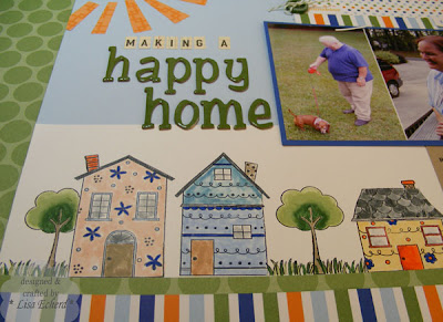
Here's a layout remembering the wonderful weekend I had with friends last weekend. I'm celebrating their new home with a house theme and her husband's great cooking with a recipe theme for the journaling.


Journaling:


Recipe for a Welcome Guest
2 wonderful people
1 loving miniature dachshund
A lovely new-to-them house
Gorgeous sunny temperate weather
Delicious home cooked soft foods
2 movies on DVD
1 best friend
Invite best friend for the Fall break weekend.  Prepare and serve delicious cottage pie.  Drive friend around to see pretty campus & new office and tour city. Intersperse movies with lively conversation.  Tour nearby town on the Inner Banks.  Toss in a couple of tasty sweet treats.  Finish with an afternoon of furniture shopping.  Plan on a repeating recipe for maximum effect.


Nichol Magourik's Scrapbook Stamping class at Two Peas for October is about building a scene from stamps.  I used Hero Arts  Whimsical Houses stamp set and added a paper pieced sunshine.  The papers are Stampin' Up!  Nichol's Wednesday video series From Start to Finish inspired the layout and button embellishments.


Their little dog Winnie shown in the photos gets her own little stamped image, too!

I bought lots of word stickers at Archivers but still didn't have the colors and words I needed so I just printed these out and added to the layout.

Thanks for visiting today!

Ingredients:  Stamps:  Whimsical Houses by Hero Arts
DSP:  Jersey Shore by Stampin' Up!
Cardstock:  Bashful Blue
Stickers:  Mini Market by October Afternoon
Thickers:  Nutmeg by American Crafts

Friday, October 14, 2011

Wonderful Visit


Last weekend, I visited my best friend, Karen, in Greenville, North Carolina.  She moved there last year for a new job.  We had a wonderful time catching up.  I loved seeing their new home.  She took me on a tour of East Carolina University and to the lovely town of Washington on the inner banks.  Her husband is also a wonderful cook!  It was such a relaxing weekend.

On my way home, I made my first stop ever at an Archiver's store!  There is only one in our state, in Raleigh.  It was just a mile off my route so it would have been a shame to drive on by.  Of course, I shot my self-imposed budget in just a half hour.  Good thing I'd given myself a time limit, too :-)  One of the things I bought is the Whimsical House stamp set from Hero Arts used for this thank you card.

I've also got plans to use this for Nicole Magourik's Scrapbook Stamping class this month.  The challenge is to create a scene on your scrapbook page and this set has several houses, the tree, a dog, cat, and a car so there are many things to put together.

Thanks for visiting today!  Hope you have a wonderful weekend.

Ingredients:  Stamps:  Whimsical House by Hero Arts, Clouds by Imaginence
DSP:  Old Olive by SU!; Daily Grind by Fancy Pants
various markers by Stampin' Up!
Twine: Enchanted Evening by PTI

Wednesday, October 12, 2011

Thanksgiving Card


A happy belated Thanksgiving to all my Canadian readers! I hope you had blessed day with family, friends and of course, food!

This card is made with a retired Stampin' Up! set Thankful Thoughts.  I bought this from my SU! demonstrator Jean and just love it.  I've done the coloring method shown here and also made the card without coloring in all the images and it looked pretty, too.  Unfortunately, I forgot to take a photo and sent all those to Operation Write Home.  It was the same arrangement only I used designer paper where the cardstock is on this one.

Speaking of OWH, I'm delighted to be on of their Featured Friday cardmakers next Friday the 21st.  I'll post a link to their blog and have a special card to share that day here on my blog.  They do such wonderful work sending cards to our troops who return the cards to their loved ones.  

Thanks to you for visiting with me today!

Tuesday, October 11, 2011

One Halloween Card


I'm back home after a great weekend with my best friend. More on that later on.  Lenny found all his little notes.

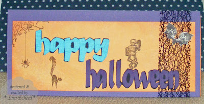
This week's Splitcoaststampers color challenge was a good chance for me to make the one and only Halloween card I mail.  This goes to Dillon with a little treat inside.  Halloween is just not my holiday.  It isn't a religious issue; I'm just not into it.

So these stamps are from a set of really cheap ones of all holiays I picked up at AC Moore a couple of years ago. There are some great images in the set but the proportions are all wrong.  Nothing works with anything else. There is a witch stamp that I didn't use because the bat is larger than the witch!  Actually the bat is larger than the cat, too, but I let that one pass.  And if a spider that big crept up on my cat, he would go running for cover and so would I!

Anyway, the colors were purple, turquoise and pumpkin pie.  I had this black net ribbon left from another project.  I cut the letters on the Cricut using SCAL software.

So what is your favorite holiday?  I bet you can guess that mine is Christmas since I've been doing Christmas cards here since July. :-) Thanks for visiting today!  (Sorry, I have no real tip today; hope to be back to that next week.)

Monday, October 10, 2011

Little Notes


When my husband went on business trips, I used to put little notes in his shirt pockets.  Now I tuck them into pockets of jeans or polo shirts when he visits his family.  This time, I'm the one making a short trip to see friends and he is staying home.  So I'm leaving him a few little notes tucked in odd places where I know he will find them.  Inside the refrigerator is a sure find spot, the washing machine is not!

Just a little tradition.... Wonder if he has found all his little notes yet?

Friday, October 7, 2011

Relaxing Day


9 photos uncropped on one page?  Yes, you can!  Thanks to the pocket and Shimelle's 4x6 photo Love class for September.  Click here for the class -- Sept 4x6 Photo Love

I followed her suggestion and used a transparency for the front of the pocket.  The top is covered with some gray cardstock that I distressed with a distressing tool.  Then I sewed it on.  I thought it looked like leather which was kind of cool.


Here are the photos in my pocket, two per side of a 6x9 cardstock.


All of these photos are from Moses Cone Estate in Blowing Rock, NC.  Everyone loves to walk around Bass Lake.  It is so beautiful and a great easy, relaxing trail.  I really needed this break with Lenny doing the driving, going to one of his customers so I really just had to make small talk and didn't have to do anything.  We also got in a little shopping.

So if you have lots of photos you want to put on one layout, Shimelle's class is just the ticket.  And it is free at Two Peas.

Hope you have a great weekend!  Thanks for visiting!

Ingredients:  Cardstock:  Bashful Blue by SU!
Transparency:  Fancy Pants Road Show collection
DSP:  Mia by Crate Paper
Flower accents:  Sculptured Flowers by Prima

Wednesday, October 5, 2011

Take care of yourself


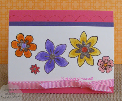
I wish I could be more like my husband who hardly ever gets stressed about anything.  He just enjoys life and seldom complains.  I, on the other hand, am the one who plans and agonizes.  I tell myself that someone around here has to do that or the place would fall apart.  Still, I wish it didn't have to be me all the time.  The thing is, it is me because it is my personality.

Yet that personality affects one's health.  Learning to relax and manage stress is necessary.  I'm trying a lot of things and one little thing I've found are relaxation videos on YouTube.  Yes, you can find most anything on YouTube these days.

Here are a couple I like that take just a few minutes to decompress:

Guided Meditation

Simple Relaxation

If you search on "relaxation meditation" you'll get a lot more.

Hope you have a peaceful day!

card ingredients:  Stamps: Deco Flowers by Paper Studio and Sweet Little Sentiments by SU!
Cardstock:  Raspberry Fizz by Papertrey Ink

Tuesday, October 4, 2011

TIPsy Tuesday - Starting a Mini Album


During Shimelle's Explore class this summer, our final assignment involved working on a task that had been put off.  I selected a mini album for my Mother.  Originally I was going to do a 12x12 Heritage album.  I'm ashamed to say that was about 10 years ago.  I did 4 pages.  Then about 18 months ago I decided on a mini album and purchased a pretty chipboard album and set aside a paper collection.  I began adding ribbons and things but that was as far as it got.


During the final week of Explore class, I selected the photos.  Having done my parents 50th a few years ago I had lots of photos scanned.  The challenge was deciding which to use.


So now I'm making the commitment to get this album done by Christmas.  I could knock it out in a few days but I confess, I just don't like to do mini albums.  And a heritage version is harder still.  Why?  I guess it is because I don't know what to journal and there is sort of a reverence to old photos that I just can't seem to get past.  Anyway, I'm doing the album with some of my own journaling but with lots of spots for Mother to make some notes.  I want this to be a surprise so I can't interview her.


My first two pages are shown above.  I dived into the middle with photos that are printed in the right size.  To be able do do that, I went back to the way I used to do all my scrapbooking, laying out the pages on blank paper.


For this mini, the album has varying size pages.  I measure them and cut scrap paper those size - one piece for each side of chipboard.  I numbered the pages and spread them out on the bed.  Then I started playing with photos to decide what went where.  I've placed them all in a folder so I can just extract the pages I want to work on together.  If I do 2 a week, I'll make it without any problem.


This picture of my parents by the car is the only one made on their wedding day.  They couldn't afford a photographer.
Do you have a project you want to complete before Christmas?  If it is a mini album, how do you work Front to back, jump around, or do you just jump in and see where the creative spirit moves you?  I think any approach works as long as it is good for you.

Thanks for visiting!

Ingredients:  Album Bo Bunny
DSP:  Crate Paper Prudence Collection; Paris and Co 6x6 MME
Ribbon:  Webster's Pages
Brad:  Stampin' Up! Antique

Saturday, October 1, 2011

Killing Time


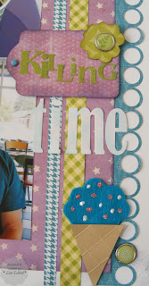
What better way to fill in a little time than by having an ice cream?  On a weekend away this spring, we lucked up on a unique opportunity to tour an exhibit of Lemurs at Duke University. The only catch was we had about 3 hours before the tour to fill in a city we knew nothing about.  So we had lunch and bummed around finally ending up at Ben and Jerry's.  Oh, what hardship!

The layout is based on Shimelle's sketch of the week. She commented that she doesn't have that much purple in her stash.  It is so hard to find purple papers!  I've found some in Halloween collections.  They can be the B-sides which is where this star paper came from.

The double punch border using the slit and 1/2 inch circle punches is featured in this blog post:  Slit and Circle punch border

The sprinkles on the felt ice cream are Perfect Pearls and Stickles.  The cone is just paper folded every half inch and then trimmed down.

Thanks for visiting today!  Hope you are having a crafty weekend.


Ingredients:  DSP: A Beautiful Life by My Mind's Eye; Cosmo Cricket Material Girl, Stampin' Up! Sweet Pea
Stickers:  October Afternoon
Brads:  KI Memories
Font:  Blackjack
Related Posts Plugin for WordPress, Blogger...